|
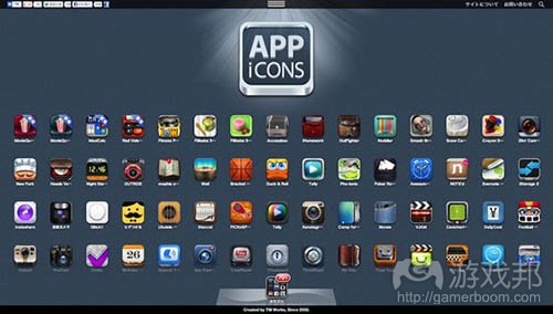
作者:Puneet Yamparala 你见过不带图标的成功应用吗? 相信肯定没有。 因为图标就是应用的包装,与零售商品一样,良好的包装也是一种重要的营销工具。它可以吸引用户注意力及激发好奇心:有时候人们靠近观察商品就是为了看看它的包装,体验一下近距离接触的感觉。 人类喜欢视觉内容。这是一种可以令大脑兴奋的娱乐形式。优秀的包装不仅仅可以吸引人们注意力和推广产品,它还可以让人们清楚: *应用内容 *开发者未提到的一些有价值的细节 如果你没有下点功夫创造出色的应用图标,你的应用也就只能在榜单压底了。 本文旨在为开发者提供一些避免出现这种情况的建议。我将在此讨论有助于你设计应用的一些建议。  app icons(from guimobile.net)
确保应用图标令人眼前一亮的建议 建议1.用一两个词来介绍产品用途 你该如何只用两个词(最多3个)来描述应用?它似乎是个艰巨的任务,但它会迫使你用最简化和最基础的形式对应用进行设想:即你想让访客对应用产生的想法和体验。 没错,就是体验而不是好处。 因为你的应用标题和描述已经描述了人们下载它可以得到的好处。现在来想象一下可以更好地描述这种体验的视觉元素或对象。令其保持简洁性,并将你产品的好处和特点浓缩成一个简单的理念和体验。 下一步,就是添加细节令其虏获用户眼球,让人们远远瞥一眼就能产生过目不忘的印象。 建议2:不要使用过时的图像 因为这会影响人们对应用的第一印象。 人们想知道开发者的确在用心创造应用。要将图标视为应用的包装,令其具有吸引力,这样人们才会有兴趣去点击查看,哪怕只是为了点开看大图。 如果想采用某张照片,最好将其转化成插画式的图标。 建议3:仔细挑选颜色 最近针对应用图标的研究发现,在6个月内排名榜单前列并且图标最受欢迎的应用中,蓝色是最普遍的颜色(占比35%),其次是绿色(14%)和红色(13%)。此外,研究还指出最佳应用图标一般会结合2至3种颜色。 色彩可以影响人们的心理,并且可以吸引注意力和暗示一种体验。一种色彩需要实现这两者的平衡才能够脱颖而出。例如,红色令人惊悚,早期针对iPhone图标的研究结论是“鲜红色令人产生‘错误,不要碰它’这类心理暗示。” 使用对比色,可以创造更深层次的色彩氛围,并令其吸引眼球,例如较暗的背景搭配明亮的前景,反之亦然。 建议4:避免使用文本 避免在图标中添加文本。图标应该是一种传递或介绍新理念的符号形式。如果你必须在其中加入文本,那一定要尽量精简。这方面的优秀典型包括Pinterest、Vine、Pocket、Ness和Snapguide。 总结——测试你的应用图标 要在多种手机壁纸的环境中测试你的应用图标。你必须从用户角度来考虑:并非人人都会使用你在测试过程中所采用的壁纸,你也不能强求这一点。(本文由游戏邦编译,转载请注明来源,或咨询微信zhengjintiao) How Can You Create an Attention Grabbing App Icon? by Puneet Yamparala Have you seen successful app without an icon? Like ever? That’s because the app’s icon is its packaging, and like retail products a good package is a great marketing tool. It draws attention and curiosity: at times people go closer (read ‘tap’) just to see what the package looks and feels like from up close (think “welcome to my app’s page!”). As humans we love visuals. It’s a form of entertainment that excites our brain. When it comes to packaging, a great package does more than engage their attention and market the product. It also shows them that: What the app is about, and That the developers have left no detail unturned to bring something worthwhile If you don’t put the needed effort into creating great icons, your app will simply get bogged down under the charts. This post seeks to highlight tips that can help develops avoid just that. In this post I will discuss tips that will aid you design engaging and compelling designs for your app. Tips that will make sure your icon is STELLAR and ACTIONABLE Tip 1: Always Start by Stating Your App’s Purpose in one or two words How will you describe your app in TWO (or at max THREE) words? It might be a hard task, but it will force you to visualize your app in the simplest and most rudimentary form: the idea and the experience with which you want your visitors to connect to. Experience, yes. Not benefits. Because your app’s title and description exist to describe the benefits people will gain by downloading it. Now imagine the visual components or objects and themes that can best describe what the experience is about. So keep it simple, and shred your app’s benefits and features down to one simple idea and experience. Next, it’s time to add the details so that it catches their attention and is recognizable and differentiable at a glance and also from a distance. Tip 2: Don’t Use Stock Images Stock images? Praises be to the Binary Lords of the App Underworld!! Don’t, please don’t! You’ll simply massacre the first impression. People want to know that the developer has put in effort into creating the app. Think of the icon as your app’s packaging. Make it inspiring so people would want to tap it even for the sole sake of seeing what it looks like bigger. If a photo has stricken your imagination, convert it into an illustrated icon. Tip 3: Carefully Select Colors A recent study on app icons found a breakdown of the most preferred icons in the top charts over 6 months, and found that blue (35%) an overwhelmingly common color, followed by green (14%) and red (13%). Furthermore, the study pointed out that the best icons had a combination of multiple colors (2-3). Colors have a psychological effect and can focus our attention as well as induce an experience. It requires a careful balance between these two to make the colors stand out. For example, red is shocking however, one of the earliest studies on iPhone icons summed it up with “Bright red feels like its saying ‘error, don’t take this one’.” Use contrasting colors. It creates a deeper color ambiance and hence makes it eye-catching, e.g. a darker background with a light foreground or vice-versa. Tip 4: Avoid Text Avoid adding text to the icons. Icons are supposed to be a form of symbols that communicate ideas, or introduce new ones. If you have to add text, keep it minimal. Great examples include Pinterest, Vine, Pocket, Ness, and Snapguide. In Conclusion — Test Your App Icon Test your app icon on multiple wallpapers. You have to work from the perspective of the user: not everyone will be using the wallpaper you used to test it, nor can you impose it.(source:gamasutra)
|