|
作者:Anjin Anhut 在电子游戏这样栩栩如生的媒介中,处理颜色要素是设计的关键。通常大家会觉得颜色设计最好留给游戏美工完成,但其实游戏设计师可通过合理颜色管理创造杰出故事和清晰玩 法。许多书籍都有谈及此内容,关于这方面的研究也很多,我的文章无法覆盖所有内容。但我依然希望你们能够从中有所启发,在阶段、关卡、空间、截面或区域设计中更有效地 运用颜色元素。下面就来谈谈电子游戏中的颜色要素。  Pic from howtonotsuckatgamedesign.com
颜色的两个沟通层次 在本文中,我将从两个层面着眼颜色沟通,即显著颜色和颜色情境。 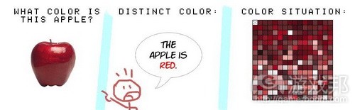 Pic.1 from howtonotsuckatgamedesign.com
显著颜色是指大家熟知的颜色。颜色描述清晰即时,在沟通上与话语或文字同样重要。从小我们就通过父母、儿童书籍、老师、游戏和玩具获悉简化认识和谈论颜色的方式。虽然 我们身边存在众多色彩、亮度和混合颜色,但在口头交流中,我们已学会锁定最突出的颜色,以最简单和通俗的方式描述它们。天空是蓝色,消防车是红色,青蛙是绿色,鸡蛋是 白色等等。也许会在必要时候加上“浅”或“深”。若你不是以设计、艺术或式样角度切入,这就是你潜意识里对事物的颜色概念。 在颜色轮盘中,我们能够轻松说出主要和次要颜色,因此它们属于显著颜色(游戏邦注:红、蓝、黄、绿、紫和橙)。第三色和复杂混合色可通过其色谱进行描述,但没有特定名 称。复杂混合颜色由显著颜色要素构成,缺乏自己的独立身份。在沟通中,这些颜色是通过相关主要或次要颜色进行描述。包含2/3黄色和1/3红色的颜色通常被形容为橙色。其他 常在对话中谈到的颜色有褐色、粉红色、肉色、银色、金色、蓝绿色、彩虹色(主要和次要颜色依次呈现)、深褐色和卡其色。有些显著颜色在特定情境下失去颜色含义:黑、灰 、白和黑白(这就媒介而言)。 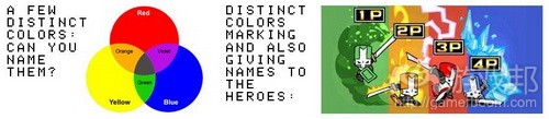 Pic.2 from howtonotsuckatgamedesign.com
我们通过其他简化方式进行潜意识的颜色描述。也就是颜色情境。混合颜色、纹理亮化和不规则化、以及实际颜色以复杂方式映入我们眼帘都属于同个能够控制的颜色情景。这些 情境都会给观看者带来潜意识影响,同我们的原始颜色联系起来。在动物和早期人类眼中,颜色是生存的工具。丰富绿色植物代表充满水资源、水果和动物生命的宜居环境。而不 饱和亮棕色则代表相反意思,表示环境非常恶劣和糟糕。亮红斑点代表危险、物理伤害和痛苦,因为这就是血液所呈现的态势。这些联系已变成下意识模式,使颜色情境变成引发 情绪和情感的有效工具。 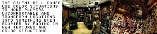 Pic.3 from howtonotsuckatgamedesign.com
从儿童时期开始,我们就学会如何下意识辨认和描述颜色情境,但这更多涉及陈述颜色情境的情感冲击,而非陈述颜色本身。为清楚陈述我的观点,我归纳如下内容:  Pic.4 from howtonotsuckatgamedesign.com
各个击破 要彻底理清脑中思绪,你需在自己的色彩构图中将显著颜色同颜色情境区分开来。如下原则能够帮助玩家辨认显著颜色和颜色情境。当然若把它们结合起来,效果更好。 目的 玩家清楚有些元素是出于特定目的而被赋予特定颜色。交通信号灯以红绿颜色向我们呈现信息,衣服的着色也有特定目的,颜色也能够充当标签。玩家还清楚有些内容的颜色没有 特殊含义。火箭呈现灰色是由于它本来就是灰色,天空呈现蓝色是由于天气。自从人类开始将颜色运用至交流中,玩家就从现实生活中学会给予颜色更多关注。若你希望玩家留心 墙上红色标记,你就会以刻意红色呈现(游戏邦注:而不是呈意外飞溅血色)。这是获得玩家关注的最大原则,他会觉得是你刻意赋予其这种颜色。
 Pic.5 from howtonotsuckatgamedesign.com
对比 这关乎控制玩家关注焦点。强烈对比能够可以是深&浅、高饱和&低饱和、红&绿和红&青。这些对比常被运用到现实生活中。想想鲜艳而饱和的黄色警带,或警示灯,这里的显著颜 色通常通过自己的光源呈现。视觉感知在颜色要素和顺序上形成反差。玩家能够发现颜色存在的差异(颜色此时和下秒出现的颜色变化)。  Pic.6 from howtonotsuckatgamedesign.com
独特性 这点很简单。若你希望玩家下意识发现蓝颜色内容,就要确保其他内容不是以蓝颜色呈现。这就是《战争机器》所遵循的原则,其蓝颜色专们描述COG装甲和武器。Gear装甲的灯光 、弹药箱信号、投掷手榴弹的瞄准点和狙击步枪的目标都以显著蓝色呈现,而与COG无关的内容就不是如此。  Pic.7 from howtonotsuckatgamedesign.com
结论 本文我们已就显著颜色和颜色情境进行区分。接着我们将就如何有效发挥二者作用进行详细描述。 图标颜色 使用显著颜色来让你的角色易于辨认。就像在公司Logo和企业标志中一样,显著颜色的简单结合很容易被人记住而且能够迅速领会。回到角色只用几个像素来构建的年代,显著颜 色是让精灵可辨且可识别的必要手段(游戏邦注:如马里奥和路奇)。现在这些技术限制已经不复存在,但是AAA游戏角色仍然需要依靠显著颜色来最大化品牌认知价值。  显著颜色(from howtonotsuckatgamedesign)
解决谜题 玩家会将有着同样显著颜色的物品和元素联系起来,甚至能够将显著颜色按次序排列。这是玩家从婴儿时期便学会的技能,因而根本不需要做过多的解释。这有助于立即创造出可 理解的游戏可玩性情境。 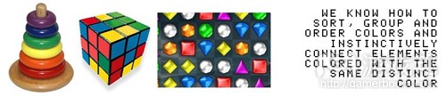 解谜(from howtonotsuckatgamedesign)
独立和从属 从桌游到运动、公司和国家再到政治活动参与方以及早期的部落时代,颜色标签都被用来标志群组的从属关系。清晰且一致的颜色语言能够帮助玩家区分好友和敌人。对于玩家而 言,知道自身的显著游戏颜色能够在任何游戏中体会到竞争感,即便游戏可玩性的核心并非冲突。《新超级马里奥兄弟》中使用的是经典的红蓝绿黄组合。Wii允许每个玩家在屏幕 上支持某种颜色,由此来识别来自其他团队和派系中的玩家的身份,就像玩家在桌游和运动游戏中的做法一样。 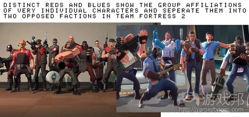 独立和从属2(from howtonotsuckatgamedesign)
颜色信息和惯例 玩家能够理解之前习得的颜色的通俗含义。你可以从现实生活中取材,使用目标用户所普遍熟悉的惯例。出于此目的,你需要提供必要的背景。单单红色便有许多含义,所以只有 合适的背景才能够引发合适的理解。在西方文化中,容器标有红色十字表明这是医疗补给,交通灯显示为红色意味着停止,机器上闪烁红灯标志着危险或故障,红色的滴状物指代 血。点着红灯的屋子可能是娱乐会所或相馆的黑屋。所以你需要根据目标玩家的文化和常识来提供背景。当然,你也可以为显著颜色设立自己的含义,但是如果你想要这么做的话 ,就要让显著颜色的含义保持一致,同时给予玩家时间和指导(游戏邦注:有时甚至需要口头解释)来习得这些含义。 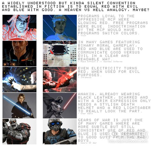 颜色信息和惯例(from howtonotsuckatgamedesign)
关注点 当玩家识别出某种显著颜色时,他总是能够更加重视和集中注意力。这可以用来引导玩家对某些元素的注意力和关注点。这也是为何众多BOSS使用显著颜色的原因。 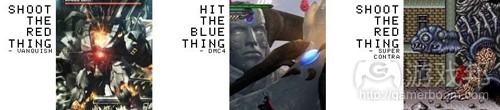 关注点(from howtonotsuckatgamedesign)
触感 颜色情境可以非常有效地暗示触感。人脑会将某些颜色同某些感觉联系起来。这其中的基础便是个人记忆和条件作用。红色和橙色让人有温暖的感觉,蓝色代表着寒冷。在颜色理 论中,我们甚至会谈论到使用相同系统来标识冷热物体的颜色温度和红外视角。白色和淡灰色很像清晨的薄雾,代表清新的感觉。颜色的明亮程度也可以表达出温度。 你也可以使用显著颜色来表达触感。比如,红色和蓝色的水箱分别代表盛装热水和冷水。你可以使用通常用来表达沸腾的热水和冰凉的冷水的红色和蓝色来呈现痛苦和轻松的想法 。 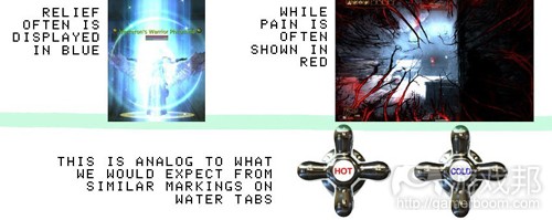 触感(from howtonotsuckatgamedesign)
环境 在决定环境是否充满敌意的过程中,颜色情境发挥着重要的作用。在人类的进化过程中,形成了在富饶的区域中觉得更加安全的感觉,也就是充斥着深绿(游戏邦注:代表植物) 、深蓝(游戏邦注:代表水源)抑或两者兼有。如果加入红色、紫色、橙色或粉色等暖色,你会觉得身处在很安逸的环境中。那些不富饶和充满生气的环境通常使用的是黑色、灰 色、棕色和淡绿色,比如沙漠、被灼烧过的土地、死亡丛林和枯萎的植物等。在这种情况下,红色就会增加威胁、热量和危险的感觉。你要记住的是,我们的祖先在选择居住环境 时会选择的颜色情境会让人觉得比较舒适。  环境(from howtonotsuckatgamedesign)
单色顺序 正因为古老照片、电影、绘画和低技术印刷的特点,以单色来演绎某种顺序会让玩家以置身于顺序之外的眼光来看待。玩家觉得自己正在观看某种描绘顺序的媒体。这种做法通常 被电影和漫画用来展现阐述,有时还会用额外的电影颗粒、闪烁或褪色的旧报纸效果来提供支持。我角色有点奇怪,很少有游戏让我们体验这种感觉。当然,单颜色情境也可以用 来展示独特边缘或基础情感基调的顺序。 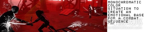 单色(from howtonotsuckatgamedesign)
活泼快乐 孩子的服饰、幼儿园、绘图工具、糖果以及大量玩具中鲜艳、充满生气和丰富的颜色是让《超级马里奥》系列游戏能够迅速风行的原因。你不是在《死亡空间》中充满敌意的灰棕 环境中战斗,也并非在《古墓丽影》郁郁葱葱的丛林中探索,你身处的是充满玩具色彩的蘑菇王国。活泼快乐这种孩子般的感觉能够被众多带有显著颜色的可识别物品所引发,所 以我们会觉得自己在同许多有趣的东西互动。  活泼快乐的颜色(from howtonotsuckatgamedesign)
总结 我觉得,需要做的观察和技巧还有很多。许多颜色影响我们情感的技巧经常被使用而且能够为人所理解。这个话题的内容可以写出一整本书。但是我希望,你能够从这篇文章中获 得某些灵感。 相关拓展阅读:篇目1,篇目2(本文由游戏邦编译,转载请注明来源,或咨询微信zhengjintiao) GAME AND SWATCH – COLOR THEORY FOR GAME DESIGNERS PART 1 by Anjin Anhut In a medium as visual as video games currently are, working with color is a key element of design. It might appear that color design is best left to the game artists, but in fact game designers can use proper color management to their advantage, to create strong narratives and clear gameplay. There are many books about this subject, many observations to make and there will be a ton of stuff unmentioned my article here. But still I hope you get some inspiration and
arguments for a more conscious use of color in whatever stage, level, world, section or area your are creating. Here is a rough write down of stuff I discuss with my game design students at Games Academy, when it comes to working with colors in video games. Two Levels Of Communication With Color In this article I’m going to tackle communication with colors on two levels, which I labeled distinct colors and color situations. Distinct colors are colors that have a commonly known name. As simple as that. Colors, which can instantly and without ambiguity be labeled, are as powerful in communication as any spoken or written word. From an very early age on we are told by our parents, children books, teachers, games and toys to simplify the way we recognize and talk about colors. While in fact there are many variations of hue and brightness and complex mixtures of colors surrounding us, in
verbal communication we have learned to settle on the most dominant colors and describing them in the most simplistic and general way. The sky is blue, fire trucks are red, frogs are green, eggs are white and so forth. Maybe adding the quality of “light” or “dark”, if necessary. If you are not thinking in design, art or styling terms, this is how you consciously process how things are colored. On the color wheel, primary and secondary colors are easily named and therefore distinct. Red, blue, yellow, green, purple, orange. Tertiary colors and even more complex mixtures can be described by their color recipe, but lack distinctive names. Those complex mixtures of color are stuck between their distinct color components, with no identity of their own. In conversations, those colors are usually labeled with the name of a related primary or secondary color. An orange color, with 2/3 yellow and 1/3 red is usually still simply described as orange. Other distinct colors, commonly used in conversations are brown, pink, flesh color (or skin color), silver, gold, turquoise and rainbow color (primary and secondary colors in sequence), sepia and khaki maybe. Then there are distinct colors, that are often described to be colorless, depending on the context: black, grey, white and black-and-white (which is a simple term to
describe the absence of colors in media). To process colors on a subconscious level, we use another simplification. Color Situations. The mixture of colors, the lighting and irregularities due to texture, just the actual colors that hit our eye in all their complexity are summed up into one manageable overall color situation. These situations have a subconscious impact on the viewer, connecting to our primal instincts. To us as animals/early humans color was instrumental for survival. Rich green plant life signals an inhabitable environment with plenty of water, fruits and animals life to live from. Low saturated greasy and browns suggest the opposite, making environments harsh and hostile. Spots of bright reds signal danger, physical damage and pain, since this is how blood looks like in the open. These kind of associations are branded into our subconsciousness and make color situations an effective tool to trigger moods and emotions. Of course as kids we also learned to identify and describe some color situations verbally and on a conscious level. But this is more about naming the emotional impact a color situation has, instead of naming the colors themselves. So for the sake of clear argumentation in this article, I’d like to make the following hard split: Divide and Conquer To effectively aim at the brain oar aim at the guts, you need to clearly separate distinct colors from color situations in your color compositions. There are a few principles, that work quite fine to help the player recognize colors as distinct or as color situations. They of course work best, when used in combination. Purpose The player understands, that some things have been given a specific color for a specific purpose. Traffic lights are red or green to tell us something, clothing is colored for a purpose, colors are used as labels and so on. The player also understands, that there are some things that just happen to have a certain color without a purpose behind it. A rock is grey, just because he is and the sky is blue because of the weather. The player learned from real life to give more attention to colors, when they have been put there by humans for the purpose of communication. If you ask for the player to watch out for red markings on walls, he always will prioritize the purposely placed red graffiti over the accidental blood splatters. This one is actually the strongest principle to make the player recognize, that he is suppose to consider the distinct colors you throw at them. Contrast This has something to do with controlling the focus of the player. Effective contrast can be light vs dark, low saturation vs high saturation, reddish vs greenish, reddish vs blueish. Those contrast are commonly used in real life. Think of the brightness and high saturation of yellow police tape or of warning lights, where distinct colors are often displayed by an own light source. The eye registers contrast in compositions and in sequences. The player can recognize the contrast between a color, which the object currently has and the color, which the object will have next. Uniqueness/Rarity This one is simple. If you want the player to consciously process everything that is blue, make sure that nothing else is actually colored blue. That’s how it is done in Gears Of War, where the color blue is exclusive for the COG armor and weaponry. The silly lights on the Gear’s armor, the signals on ammo boxes, the aiming aid when throwing grenades and the sight of the sniper rifle all appear in distinct blue, while everything not COG related consequently isn ’t. Epic even goes as far as giving blue lights to now “friendly” hijacked Reavers and Brumaks. Of course the strong saturation contrast to the environments comes into play also. Conclusion Part One Now that we got the two buckets of colors separated and cleared up, let’s check on how to utilize them to full effect in part 2 soon. This is a follow-up to part one. I established some terminology and principles in part one, building up to this article. So read it. No, honestly, do it. Let ’s check out a few of thousand ways to use color situations and distinct colors to your advantage.Iconic Colors Use a limited selection of distinct colors to make your characters recognizable. Just as it is with company logos, corporate identities, simple combinations of distinct colors are easy to remember and quickly to grasp. Back in the days where few pixels needed to flesh out a character, clear distinct colors were necessary to make sprites readable and recognizable (think Mario and Luigi). Nowadays those technical limitations don’t exists. But AAA characters still
maximize their own and their franchise’s value of brand recognition by betting on distinct colors. Marketing win. Puzzle Solving The player connects objects and elements colored in the same distinct color and is even able to bring distinct colors in order. This he learned from baby age on and later needs no explanation anymore. This helps create instantly understandable gameplay situations. Separation And Affiliation From boardgames, over sports, companies and nations to political parties and back to the days of tribes and caves, color labels are used to mark group affiliation. A clear and consistent color language helps the player separate friend from foe. For a player to know his own distinct game color gives any game a sense of competition, even when the gameplay is not centered around conflict. The classic red blue green yellow combo used in New Super Mario Bros. Wii, allows every player to identify with a color on screen and recognize the other players to be from a different party/team/faction, just like he learned when playing board games and sports. Color Information And Conventions The player can understand previously learned conventional meanings of colors. You can take from real life, by using the commonly known conventions of your target audience. For that you need to provide the necessary context. Red in and out of itself can have many meanings, so the right context is needed to trigger the correct interpretation. In western cultures, a red cross on any sort of container = medical supplies, a red traffic light = stop, a red light blinking on a machine = danger or malfunction or a red drop = blood. A red lit room can be a bordello or a photograph’s dark room. So check on the culture and common knowledge of your target gamer and provide context. You can of course establish your own meanings for distinct colors, but if you want to do this you have to be consistent with your distinct colors and give the player time and guidance (maybe even verbal explanations) to learn. Focus When the player recognizes a distinct color, he will always give it more importance and attention over the overall color situation. This can be used to direct the attention and focus of the player towards certain elements. This is why so many bosses have distinct color weak spots. Tactile Sensations Color situations are a very effective way to suggest tactile sensations. The human brain is wired to attribute certain feelings and even the taste of things to certain colors. This is mostly based on memory and conditioning. Reds and oranges are associated with warmth and heat, while blues suggest coldness. This can simply be backtracked to the sensations of fire and water. In color theory we even talk of color temperature and infrared view uses the same system to
mark warm and cold objects. Whites and light grays, like early morning fog, suggest freshness. Another way to suggest temperature is warm brightness, referencing sunlight. You can also convey tactile sensation by using distinct colors. A water tab for example is marked with red and blue for hot and cold water. You can use red and blue, commonly used to indicate burning hot and cooling cold water, to indicate a similar ideas of pain and relief on screen. Environments Color situations play an important role in determining if an environment is hostile or friendly. Humans are evolutionary primed to feel most secure in fertile areas, which are indicated by strong greens (plant life), strong blues (water) or both. Now adding hints of red, purple, orange or pink, anything warm and you have a very comforting color scheme for your environment. Not so fertile and life friendly environments, like deserts, burned areas, rock, dead wood, rust, rotten plant life come in a mix of blacks, grays, browns, and pale greens. Red adds an idea of threat, heat and danger here. Just keep in mind, what overall color situations our ancestors where searching for or avoiding, when picking a place to stay. Monochromatic Sequences Due to the qualities of vintage photography, old film, drawings and low-tech print, placing a sequence in monochromatic colors makes the player look at the sequence from the outside. Instead of being in the sequence, the player feels like looking at some sort of media depicting the sequence. This is often used in movies and comics to illustrate a flashback or exposition sequence, sometimes supported by additional film grain, flickering, washed out areas or fake old paper effects. I’m kind of confused, that there are so little games letting us play monochromatic flashbacks, regarding that black-and-white and sepia are so commonly understood. Monochromatic color situations can of course also be used to give a sequence a unique edge or baseline emotional tone. Playfulness The bright, vibrant and oh so random colorfulness of children’s clothing, kindergartens, kid’s drawing utensils, candy and heaps of toys are one of the many things that make Super Mario games instantly appear to be fun. While you fight in the hostile gray-brown environments of Dead Space, explore in the lush green jungles of Tomb Raider, you play in the toy-colored mushroom kingdom. The key here is not to just spread around colors, so that they blob together into
one homogenic mix. Playfulness, this childlike feeling, gets triggered by a lot of recognizable objects with distinct colors, so we get the appearance of many fun or tasty things to interact with. Conclusion Part Two Like I said, there are a 1001 more observations to make and tricks to note. The many more ways in which colors affect us emotionally, are conventionally used or culturally understood. One could write a whole book about this subject (and some probably already have). But I hope, that you can extract some inspiration from this write down. If you can, you should check part three, where I share some cool tools and tricks to work with color on a game concept level.
| 


 IP卡
IP卡 狗仔卡
狗仔卡 发表于 2015-1-2 22:55:38

 提升卡
提升卡 置顶卡
置顶卡 沉默卡
沉默卡 喧嚣卡
喧嚣卡 变色卡
变色卡 千斤顶
千斤顶 显身卡
显身卡