|
作者:Michael Jungbluth 介绍 以视觉呈现的形式来表达感觉无疑是一种挑战。但是这正是动画师一直在做的事情,他们所使用的准则可以运用到游戏设计中。 事实上,我们也需要这么做,因为动画师使用的许多原则可以提升游戏可玩性。幸运的是,动画师和设计师都需要经过几个共同的阶段才能将他们的创造物呈现出来,因而可以看 做是在说同一种语言,只是所用的表述有细微的差别而已。 下文将列举出12个动画设计原则,它们不仅可以用于动画设计,还与游戏设计有直接的关联。动画师和设计师都会迅速地意识到,这些原则中许多属于被人闲置的真理,但是了解 这些可以让他们有所进步。 这些原理可以给游戏增加额外的筹码,深化游戏及其中的角色。这些原则中有些存在内在联系,结合使用这些原则将使得角色的行动和情感都有一定的重量。而玩家可以感受到这 些内容。 “如果要突出感觉,动画师就需要研究感觉,去感受感觉背后的力量。”——Walt Disney 挤压和伸展(Squash and Stretch) 动画中的运用 这是重量最显眼的表达方法,也是动画师首先学习和喜欢上的东西。球体的弹跳可以展示这个原则。 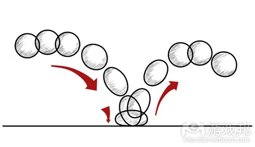 球体弹跳过程中的挤压与伸展现象(from gamasutra)
在动画中,为展现重量感,球体在下落的时候会伸展,着地时会受到挤压,弹回时再次伸展。这样,可以从视觉上看到重心在物体上的移动。 将这个原则运用到角色上,以跳跃为例。在他们向上跳之前,需要先下蹲积蓄能量。当他们跳出时就会将身体伸展开来,和球体的弹跳相同。 这项原则也被运用到面部动画中。如果你想要让某次尖叫看起来更有效果,可以将角色的面部扭曲,眼睛闭起眉毛收拢。即便是那些不起眼的时刻,你也希望能够有很强烈的感受 。原因在于,这是人们察觉身体处理和分配质量的途径。 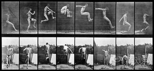 人体在运动过程中的伸展与收缩现象(from gamasutra)
但是,如果挤压和伸展使用不当,会对物体或角色产生影响。物体的整体重量必须在静态、挤压和伸展时保持一致,这是最为重要的事情,必须铭记。质量的改变会立即影响重量 感。 游戏设计中的运用 在游戏设计中,挤压和伸展本质上是相对的。先让游戏将即将发生的事情储存起来,然后将其展现给玩家。确保让他们在每次行动中都可以感受到伸展。 伸展他们的能力,伸展他们的资源,伸展他们的经济投入。然后用挤压的影响来替代这一切,这样玩家就可以知道自己承载了多大的重量。不积硅步,无以至千里。这种对比正是 核心所在,不仅可以看玩家看到重量,更重要的是,能够让他们感受到。 如果你能够在每个行动中创造出这种对比性,无论这种对比多么渺小,都可以让玩家所做的事情营造出重量感。只是要记住,容量不可发生改变。因为它可以保证重量的可靠性, 让你创造出的所有东西保持真实感。 实践这个原则的最简单之例便是枪支。如果武器火力较小而且开火较快,那么挤压和伸展的空间将会很小。现在,我们以用来引发爆炸的枪支为例。你积蓄力量的时间越长,引发 爆炸的强度就越大。你将枪支的能量积蓄到极限,那么引发的爆炸就可以产生极大的破坏力。 通过以上两个例子,你可以感受到挤压和伸展的重要性。但是让它们产生出合适的感觉才是关键。动画师提出的技巧是,推得尽量远然后拉回会更为简单。 这里的意思并非向太空中最遥远的星球射击,然后将该星球拉到你面前。你要做的是找到最适合的目标星团,燃火瞄准该星团中最远的那颗星球。因为随着时间的推移,你在润色 自己的作品时便会自然使其进行伸展。 对于玩家控制的角色而言,这个原则并不适用,因而挤压的那段时间意味着玩家将对角色失去控制。 但是,当玩家按动控制器上的按键或点击鼠标时,他们可以感受到触觉上的挤压。这是个让玩家感受挤压的绝妙措施。 挤压和伸展是为你所制造的东西迅速添加重量感的最简单的方法。正因为此,这也是人们最喜欢使用的方法。 但是只要你保持物体真实性这个核心,时刻关注视觉效果传达出的感觉,这绝对是个传达重量的可靠方法。 动作预备(Anticipation) 动画中的运用 对于每次行动,你都有一定的预测结果。在故事讲述和行动设计方面,这或许是动画师使用的最为重要的工具。而事实上,这项原则通常被游戏设计师所使用。动作预备不仅可以 传达重量感,而且可以用来在行动发生之前吸引玩家的注意力。举个动作预备的视觉范例,比如棒球投手。在将球投出之前,他们会先挥舞手臂。如果没有动作预备,投手的行动 就会变得让人无法理解且失去重量感,因为没有任何迹象显示接下来将要发生的事情。动作预备也是让玩家沉浸在即将发生的事情中的首个步骤,他们会积极地将思维导入到可能 发生的事情中。在意图传达含有重量感的故事、行动或情感时,这是个强大的工具。 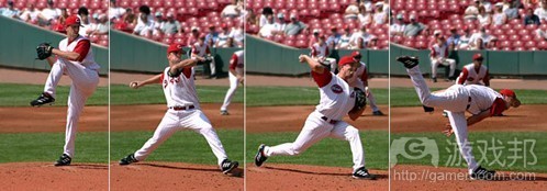 击球手看第一张图就能预测到他下一步的动作,并据此作出反应(from gamasutra)
游戏设计中的运用 在游戏中,动作预备是最显而易见的事物,通常用于敌人的攻击中。在玩家考虑下面即将发生的事情时,便是动作预备在发挥作用。敌人站起来就相当于给玩家一个信号,让他们 知道接下来将发生的事情。从视觉上来说,他们身体重量的扭曲和移动使得玩家的感受更加强烈。而且,玩家会开始思考攻击将会在何时发生,如何才能最有效地化解。而这些得 出结论和解决问题的过程正是人们玩游戏的原因。如果没有预测,数字世界中发生的所有行动都失去重量感,玩家也不会在虚拟世界中有情感投入。你预测和构建行动的时间越长 ,所暗示的行动就会越强大。同样,较小的动作预备就意味着较小的结果。你可以直接从挤压和伸展原则中体会到如何构建动作预备。 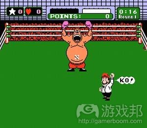 《PunchOut》中的King Hippo的动作反映了其个性及游戏玩法(from gamasutra)
如果你想要为行动或机制添加大量角色和个性,那么动作预备也可以发挥作用。这便是《PunchOut》取得成功的原因,游戏不仅含有令人难忘的角色,而且还有绝妙的可玩性。预 测与视觉效果、结果、玩法和个性化完美配合,构建出完全新鲜的体验。如果角色正在做一个预备动作,那么他们在做的就是思考下一步将开展什么行动。如果他们以某种独特的 方法进行预测,那么可以继续洞察他们的思考方法。为角色添加思考过程是让角色栩栩如生的首选方法。 但是除了用来传达角色行动之外,动作预备还可以用来让玩家为即将发生的事情做好准备。想想那些过时的设计方法,让玩家储存生命值以应对大型的挑战。当玩家走到有着大量 弹药和补充生命值道具的地方时,就会自然地预见将有场大型战斗即将发生,他们这时就会开始考虑将会发生的是什么事情。这种做法很强大,因为你已经调动玩家的思绪,他们 开始思考世界的规则并为还未显现的问题制定解决方案。 虽然满足或否定这些期望很让人满足,但是期望的传送并不只限于只两个方面。你可以先构建起某些东西,然后让玩家产生期望。如果与预测相符,那么就会更有意义。事实上, 任何成功中都存在与预测相关的猜想。行动也可以比预测更小,喜剧题材总会使用这种方法。以迪斯尼的动画短剧为例,高飞(游戏邦注:迪斯尼旗下卡通角色)做足了准备,积 蓄了大量的能量,最后只是将球抛出一小段,引人发笑的正是行动与预测间的差距。但是,如果做法更为微妙的话,这些内容应当是被玩家感受到,而不是看到。如果差距过远, 会将玩家拉出游戏情境,因为游戏中的设置已不再可信。如果丝毫没有此类内容,玩家又会觉得游戏并不真实而且与其他体验毫无关联。因而,行动的结果需要同预测相适应。 这是本列表中最为强大的工具之一,因为它完全围绕玩家来构建。而正因为此,玩家可以马上将思绪投入到游戏中,我们能够传达的就不只是叙事或视觉成果。他们的投入意味着 他们可以对预测做出反应,可以让事件发生,也可以尽量去改变结果。而让这些改变具有重量感,不仅需要游戏作出有意义的反应,而且还要重视那些驱使玩家做出选择的预测。 动作表现力(staging) 动画中的应用 动作表现力要让玩家一目了然地把握游戏世界中最重要的元素。这意味着开发者需知晓自己想要向玩家传递什么信息,让所有内容都配合此焦点。清晰是关键,把握整个情境是根 本。在动画中,这意味着屏幕上的所有内容和表现都要着眼于重要元素。 游戏环境、角色姿势、手势及眼神都要围绕重要内容。即便没有话语或声音,玩家依然需要能够立即理解自己的所见,同它们建立联系,因此清晰的分层展现非常关键。 动作表现力也指当角色或情境深层含义有违实况时,你如何从心理角度影响或欺骗玩家。调节摄像头或放置物品会迅速让玩家以微妙方式感受到情感冲击。 游戏设计中的应用 在游戏设计中,你要顾及整个游戏情境。考虑角色所处位置、灯光、升级道具的放置、干扰设置及形状的定义。相比宽阔的开放空间,散落众多残骸的长廊给人什么感觉?若背景 是森林,想想盘根错节的树木同高耸红木及年轻幼苗的区别。 理清游戏意图和主题,所有元素都要围绕当前最重要的内容、关卡和叙述故事。然后创建完这些主要目标后,确保情境中的所有元素都围绕此焦点,没有出现相互竞争的情况。 因为当各元素相互竞争时,玩家就会困惑自己要朝何处前进,游戏的目标是什么,基于什么制,下步要进行什么操作。一旦设计师或游戏未能清楚呈现对玩家的预期,他们就不 会继续投入其中。一旦投入感丧失,找回玩家比最初获得他们更加困难。 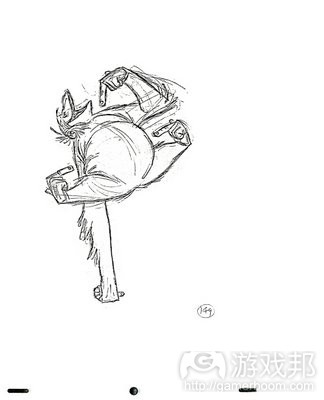 《森林王子》动画片中的一个关键帧画面( from gamasutra.com)
这并不是说你一次只能操作一个内容。而是指仅向玩家呈现最重要的玩法元素。确保你和玩家都只锁定最适合情境的工具或机制,让其他所有元素和机制都支撑和配合此焦点。这 将让元素变得更强大,在游戏世界中更具重要性,能够有组织地同玩家、游戏和设计师创建联系。 深度和空间是体现动作表现力的重要元素。让2D屏幕上的角色看起来沉浸其中的最快方式是让姿势和表现深度富有层次。动画家通过重叠身体部位,把握身体周围的负面空间及轮 廓设计实现此目标。他们顾及前景、中间地带和背景,让角色的姿势富有深度,能够凸显焦点。 设计师还需关注核心玩法的深度。你定不希望所有机制在同个情境中都呈现相同层次。进行分层处理,这样有些内容会居于背景,退回玩家的脑海,而有些则出现在前景。 这对在机制中引入新功能或升级内容来说尤其重要。同时还适用习惯性的背景机制。若某些前景元素需要更多关注,它们无需太多细节便能够立即被识别(游戏邦注:例如需要玩 家给予更多关注的高级机制)。 判断动作表现力或姿势是否适合动画的最快方式是将其缩减至简单轮廓。这能够带给游戏设计颇多益处。你所要做的工作其实上就是排除白噪音,这能够帮你略过所有细节。其目 的是探究设计师能否通过最少信息获悉进展状况,核心内容是否足够强大,能够独立存在,角色或情感是否能够仅凭形状就得到辨认。 这能够以多种方式在游戏设计中得到落实。以粗糙几何原理创建游戏,确保体验过程即便没有艺术元素也非常有趣。在没有任何灯光的情况下,看看自己能否通过调整关卡将玩家 带入自己期望的方向。将玩家设置成T姿势,看看自己能否在没有详尽动画的情况下创造期望的情境。 你能否仅基于敌人的速度&时机,在没有短跑、跳跃和装备元素的情况下创造追逐紧张感?你能否通过合理设置T姿势角色的穿梭方式让环境变得栩栩如生?因为若游戏轮廓鲜明, 那么玩家在其中所进行的所有操作都会产生一定影响。 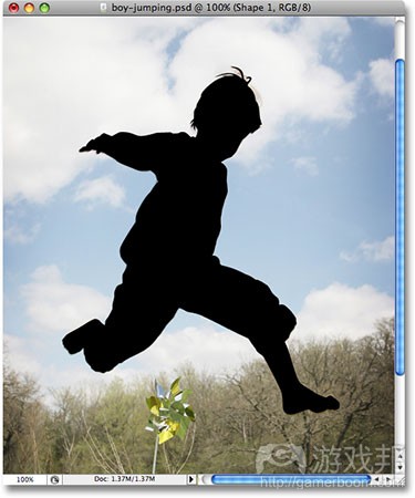 有时候我们从剪影就能看出角色的年龄、情感和动作(from gamasutra.com)
若玩家迷失下步操作或丧失兴趣,查看动作表现力模式能够有效探究其中缘由。或由于呈现内容消失,或由于余下体验未能有效配合核心玩法。但若你总是牢记动作表现力模式, 总能弄清此刻的焦点,你和玩家就能够继续前进。当所有内容都有层次地呈现时,你所创造内容的重要性就能够通过周围事物体现。 一气呵成 &按关键帧方法(Straight Ahead & Pose to Pose) 动画中的应用 此原则主要涉及设计过程。这是发现和创造表现角色和目的的两种不同方式。 在动画领域,一气呵成指从开端着手,在执行过程中挨个完成每帧画面。这意味着玩家要始终置身角色中,牢记游戏目的。这根本来说就是玩把戏。若不够细心,你的时机会迅速 消失,你的操作会缺乏连贯性,角色会丧失真实性。 按关键帧方法是指你预先找到表现或动作的主要节奏,先呈现关键帧的画面。这意味着你锁定的姿势非常强大,你能够迅速把握整个内容的表现方式。只要这些元素确定,你就能 够集中着眼于保证中间元素顺畅连接。你需确保所创造和安排的姿势&表达都达到你期望的目标。这里需注意的是,不要让所有要素变得过于按部就班,以致表现过于呆板,缺乏生 气。一旦内容变得呆板,其质感就会大打折扣。 就如你所看到的,这二者都不是万能丹,但能够创造真正具有质感的内容。 游戏设计中的应用 在游戏设计中,两种方式能够完美转换。这归根结底其实就是已知&未知,和动画一样,综合运用这两种方式能够让游戏设计获得最佳结果。 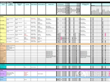 uncharted 2 prod from gamasutra.com
纸上规划就运用了一气呵成的方法。你可以先在纸上确定主要机制和解决方案,这样你就能够迅速把握核心,然后再充实中间内容。这非常适合存在较大在线团队的情况,因为这 方便向大家呈现规划好的蓝图。同大家分享图表,这样大家就会知道自己的工作职责是什么。立即确定核心节奏、时刻和机制能够促使相关人员中持续关注整体蓝图。若有内容无 法在纸上确定,最好的办法就是逐步解决。这就是采用一气呵成方式,这样你就能够测试未知元素,查看其中能够有效运作的内容。这需要大量沟通,能够整体把握创造目标,及 成员对各种规则的信任,因为无人能够独立操作。这根本来说就是个即兴表演,所有相关成员都要能够相互理解。这就是所有权及积极、有组织创新内容的诞生地。但同时也是最 可能出现失败的地方。这根本来说就是义务表演。此时你无比鲜活,但若是犯下重大错误,你也能够感觉到。 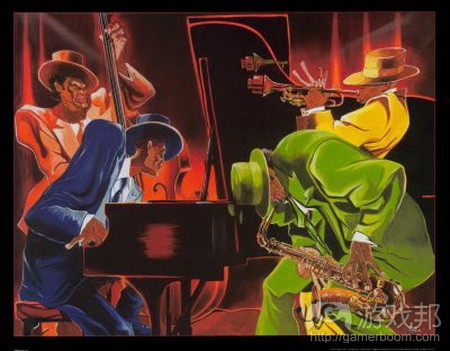 jazz from gamasutra.com
把握各方式的运用时机及二者利弊非常重要。在两种情况中,我们都需要通过优秀技能辨别哪种方式更适合,判断目标是否依然保持一致。若你只在开发中采用一气呵成法,那么 团队成员就会觉得自己无足轻重。但若你只采用按关键帧开发策略,你就会迅速发现有些内容与整体脱节了,大家的愿景并不一致。但除管理团队外,这也适用于设计关卡、升级 玩家操作或创造更复杂的谜题(游戏邦注:在创建内容时,你的选择不外乎这两种)。 二者的结合能够创造最佳结果。当你遇到未知情况时,最好基于按关键帧方式进行思考,这样你就能够找到有效运作方式。这让你得以学习和试验关键要素,直到你确定其优点所 在。然后进行某些一气呵成的设计,将这些定型的动作或功能联系起来。此时你知晓自己的工具和意图,任由它们发挥,任由自己的下意识想法展露出来。 但二者都能进行创新。广泛创新的运作模式是通过思考和讨论把握原始构想。你通过公开讨论解决各种问题。通过一气呵成法,我们能够找到富有意义的迭代创新。正是这些小惊 喜让你获得良好感觉。但通过结合这两种方式,你能够保持创新的重要性。 动作惯性跟随 & 动作重叠(Follow Through & Overlapping Action) 动画中的应用 无论你何时有动作,都必须能够过渡到下个动作,身体的不同部分在不同的时间移动和停止。通常情况下,这两个词语可以互换,但是二者之间还是存在细微的差别。动作惯性跟 随的意思是,在物体停止之后,某个单独的部分还会继续移动。动作重叠指身体各部分的运动趋势,以及如何使用这种趋势从一个动作导向下一个动作。 我们先来阐述惯性跟随。以能量为例,它是无法停止的。它需要转化通过终点。正是这种惯性跟随通过身体和表现传达出重量感和连接性,同时向玩家展现动作的来源。在动画的 运用中,我们仍以跳跃为例。当你找地时,你的身体并没有马上停止,虽然看上去是这样的。即便是臀部先着地然后再站起来,你也会有诸多动作,比如压缩脊椎和低下头。你的 手臂也会在身后不断伸展压缩。身体各部分的这些移动都是很自然的。现在想象下某个正在打出勾拳的角色。手臂下垂后摆,身体其他部分上升,手指向下弯曲成拳然后打出勾拳 的动作。身体各个部分并没有在动作过程中有丝毫停止,而是流畅地从一个动作过渡到下个动作,使得身体做出拳击的动作。而其中的链接动作就是重叠动作。 重叠移动和表现使得角色栩栩如生,让他们看起来充满生机。如果没有这些内容,他们只是个机器,从一个任务转移到另一个任务,失去了所有的情感和灵魂。 游戏设计中的运用 在游戏设计中,这意味着无论玩家做出什么或者无论游戏世界中发生什么,都应该产生反响。事情必须在完成之后导向下个将要发生的事情。动作之间应当有所联系,你刚刚做出 的动作会影响到你接下来要做的动作。这些内容并不一定要让玩家看到,但是必须要让玩家感受到。而需要惯性跟随的正是那些玩家动作之间的反响和联系。射击后可以通过弹孔 、击伤敌人或摧毁坦克等方式表现反响。构建玩家有着绝对自由的世界,其中玩家做出的每个动作和决定都可以产生与现实状况相同的结果,但是与其他原则相同的是,这种设计 的关键在于让玩家感受到,而不只是看到。可能只是个简单的听觉暗示,抑或只是轻轻的点头。因为同其他原则一样,惯性跟随必须要与行动相符。比起较轻的物体来说,较重的 物体运动的延迟时间较长,停起来也较为缓慢。这便是在动作中表现重量感和真实性的实例。 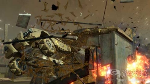 爆破场景是游戏中最常见的惯性跟随现象之一(from gamasutra)
惯性跟随是所有东西如何对刚刚发生的事情做出反应,但是不总是必须与某些东西重叠。事实上,如果所有的东西都互相重叠,会变得很混乱。重叠是用到那些推动下个任务或动 作的事物上,帮助玩家感受到体验所必要的东西。如果没有重叠,动作就会显得空洞。重叠任务的结果和如何导向下个任务会让事物变得很可笑。如果你想要创造的是活生生的世 界,那么在NPC的AI方面这一点特别重要。不幸的是,通常这些却是在制作角色时首先不被重视的东西,因为设计师对动画感到厌烦,将此仅仅看做是给程序员的服务而已。但是如 果没有那些过渡的重叠,NPC就像是在游戏世界中漫无目标游曳的物体而已。在设计区域时,应当注意到你的NPC角色会在那里做什么事情。当要求攻击状态改变时,考虑为何他们 摇这么做。刚开始属于动作预备的范畴,但是如果没有惯性跟随,预备就会显得平淡无用。惯性跟随是动作预备拉伸的挤压。而如果出现你无法为某些事情做预备时,惯性跟随便 是最好用的黄金法则。如果你想要快速地移动某些很大的东西,你可以跳过预备来掩饰重量感,但是要确保有大量的惯性跟随来容纳如此重量的东西快速移动。因而即便这个物体 像子弹般快速移动,可以通过给予火车的惯性跟随来维持所有其他动作的重量感。 重叠和惯性跟随是将玩家互动转变为深层次奖励性体验的东西。如果成就、奖品或徽章的使用是我们作为开发者提供的惯性跟随形式的话,那么我们在与玩家的交流就存在偏差。 惯性跟随和重叠是我们回答玩家有关目的感和重量感的问题的方法。 渐进 & 渐出(Slow In, Slow Out) 动画中的运用 紧急暂停或方向上的迅速改变导致你脱离表现或动作,这是最糟糕的情况。完全的静止也会影响到所呈现物体的真实性(游戏邦注:除非是死物)。这个原则还通过物体开始或停 止的时间来呈现物体的重量。在所有的动作中,事情发生之后或准备开始发生之前都会有预备动作。每个动画师学习的来呈现这种情况的练习是钟摆。通过轨道中部时,钟摆的移 动非常迅速。但是在接近轨道的顶点时,摆动速度就会变慢许多,这是由于地球引力的存在。在达到顶点之前,钟摆会逐渐丧失冲劲。随后又开始下落,此时地球引力让它的速度 逐渐加快。 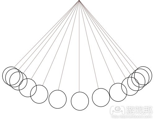 钟摆上场时增加画面帧数,表示速度放慢;而中间减少画面帧数表示速度加快(from gamasutra)
这个原则又是构建于挤压和拉伸之上,但是除此之外,玩家可以在某些时候于动态期间看到物体的形态。这让动画师有时间将物体从某个姿态转变成另一个姿态,确保重要的姿态 可以被玩家看到,同时避免完全静止情况的出现。这使得动作可以清晰地辨别出来,而且仍然显得鲜活。根据动作的不同,动画师可以采用两种不同的方式。缓慢进入就是像上图 所示钟摆的情况。而另一种方法是先夸张显示,然后转变成某个姿态。物体的重量不同以及所采用的方法不同,二者给人的感觉也有所差异。 游戏设计中的运用 在游戏设计中,转变是很经常发生的事情。带着目标,玩家应该逐渐地进入和渐出他们被要求完成的任务。谜题的复杂性应当逐渐增加。但是新的游戏玩法机制可以采用忽然进入 的方式。通过首次遭遇战让玩家与新的敌人对抗,然后轻微拉伸下个遭遇战来提升挑战难度,然后再返回,这样会让他们产生掌控局势的感觉。新力量的出现也可以使用同样的方 法。要铭记的是,重量的确会产生影响。当你多次采用渐进渐出时,玩家会认为这是个重要的东西,因为你保持他们对事物的关注。如果你只使用几次此类设计,那么玩家就没有 足够的时间来真正感受事物的重要性。  每个球弹跳时的重量感变化取决于其渐进渐出弧度(from gamasutra)
渐入渐出的程度很难掌控,这也就是游戏测试存在的意义。这个动作是否过于突兀或者令人困惑?如果是这样,那么就需要放慢上个动作。玩家是否会因为我们没有给予足够的时 间来研究此刻正在发生的事情而失败?那么这些动作就需要被放慢,这样玩家才可以掌握全部的内容。这个部分是否因为过于缓慢和花费过长的时间而显得没有足够的爆发力?渐 入和渐出会强调每个行动的重要程度。如果不恰当使用,那么游戏的真实性就会受到影响。 当渐入渐出变得过于明显或者放慢了整体的游戏过程,那么可以使用某些重叠,因为你需要记住的是,所有东西之间都存在联系。渐入渐出给予你足够的时间来构建重叠,同时不 会导致游戏内的东西过于杂乱和不相关。 渐入渐出可以在角色构建计划时使用。下个动作的预期还未出现,因为下个动作是什么还未决定。此时正在发生的是重叠和惯性更随。而这是个很重要的时刻。这是个事物开始发 展的时刻。这是个所有碎片被拼凑起来的时刻。这是个我们为玩家呈现所设计的所有内容的时刻。我们希望他们能够思考自己正在做的事情,即将做的事情和想要做的事情,因为 此刻他们完全投入游戏中,成为游戏的一部分。当他们最终对游戏要求他们做的事情做出回应时,他们就会真正感觉到他们是做出一个决定,而不只是动作。在这个时刻中,游戏 和玩家占据了同样的空间,分享彼此的分量。 弧线(Arcs) 动画中的应用 这也许是所有人都知晓的一大原则。任何液体或物体在移动时最快速的移动方法便是沿着直线走。而且当我们想从A点移动到B点时,走直线也是最快捷的方法,但是直线也会让人 感到无聊。这是一种直达目的地的路线,而很少会牵扯到过程的乐趣。但是通常这种移动的过程正是显示物体的变化及其意义的过程。 动画的过程则有点像钟摆。它不会直线型地从一个顶点滑落到另一个顶点,而是会划过一个漂亮的弧形并停落在中央,再往另外一个方向摇摆。整个运转的场景非常好看,并且吸 引人去探索这种弧线的乐趣。而这种极致的弧线美能够传达出很多内容,或宏伟壮丽,或轻盈精致,很难让人移开眼球。从这种移动的过程中我们可以看出物体的特性,并赏心悦 目于这种优美的移动线条。而如果不使用弧线,则会让观众感受到一种冷酷,失重且不自然的感受,所以这却只适用于动画中的机器人描述,或者像Spock(游戏邦注:《星舰迷航 记》里的角色)这类型的外星人。 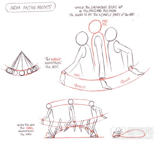 手臂移动(from gamasutra)
如上图,这是Richard Williams的《Animator’s Survival Kit》中关于身体运动的弧线描绘。注意身体每个部分的运动变化,特别是臀部。 游戏设计中的应用 在叙述中,这种原则便更加明显了。我们在小学就学到了传统的叙事弧线。不论是角色弧线还是故事弧线都是创造出强大叙述的基本要素。每一个角色和故事都必须拥有一个循序 渐进的发展过程。随着这种过程的发展,它们将能够到达一个最高点,并在后来开始慢慢往下回落。 而在游戏设计中,弧线的使用也是相同道理。即玩家的游戏过程或者游戏机制的变化都是按照弧线而展开。当玩家在游戏中前进时,游戏机制将会一层一层展开,但是在最后,为 了让玩家顺利完成游戏,游戏机制也会适时地一层一层合拢起来。一般来说,游戏总会在一开始就往机制中添加更多功能,直到一个饱和点。但是你必须知道应该在何时止住,并 往回走,懂得张弛有度,让玩家能够最大限度地吸收自己的所得。当游戏开始回收这种机制弧线时,玩家便会松一口气,且更愿意去尝试并吸收下一个机制弧线。弧线是用于连接 起点和终点,同时也能够体现你所创造出的优美而流畅的重叠动作。但是你同时也必须清楚在游戏的最大弧线中哪个点是最重要的,且每一个小弧线之间都不能存在任何矛盾点, 且应该与大弧线完美地连接在一起。 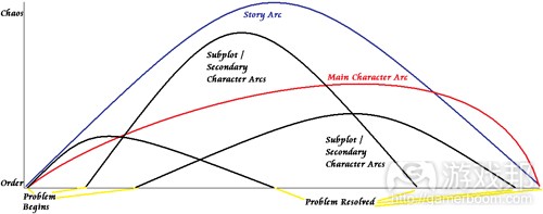 注意每条弧线的层级,以及小弧线是如何维持整体的故事弧线(from gamasutra)
如果在游戏中每个敌人,武器以及关卡都拥有属于自己的弧线,那么不管这些内容的分量大不大,都能够与游戏世界更好地连接在一起了。这种小弧线能够更清晰地体现出游戏内 容的发展和变化,并在游戏设置中更深刻地展露出它们的功能。其实这已经形成了一种定律。当你在游戏中遇到一个新的敌人时,都会出现关于该敌人的简介,而这就是弧线的起 点。然后你开始与敌人战斗,并经历各种程度的攻击与防御,直到最后打败了敌人,而这便是游戏的高潮。后来的结果便是敌人的死亡或者投降。你益智游戏也常使用这种弧线。 你在游戏中创建了布局和工具,让玩家在游戏中面对不同难度级别的问题,慢慢提高挑战,直到玩家最终完成游戏。而当玩家最终完成一个较为简单的问题后,游戏弧线便回到了 与起点持平的界面。如果游戏弧线的设置足够合理,流畅,玩家定会喜欢游戏。 我们需要记住,如果让玩家沿着直线通过一个目标或关卡可能会很不自然,但是如果能让他们按照弧线移动,也许他们的游戏体验便会更加顺畅了。就像是坐过山车时,我们会在 最低处大松一口气,并在最高处屏足呼吸。当你在游戏中使用了弧线,你便能够在游戏中更自由地移动,并且更深刻地感受到游戏体验。而这时候玩家与游戏便能够更紧密地结合 在一起了。 副体或副动作(Secondary Action) 动画中的应用 动画中的副体包括了头发,披肩,尾巴,旗帜等。它们也许对核心内容没有任何影响,但是却能够起到额外的视觉效果。举个例子来说,当你看着一个人的时候,他的身体便是主 体,而其它部位则是副体。副体是外部内容,但是却牢牢依赖于它所附着的主体。副体是一种外表现象。并且副体能够帮助我们更好地衡量一件物体的重要性,因为副体通常都是 一些比较不重要的角色。实际上,很多副体都是通过弧形动作和重叠动作体现出来。 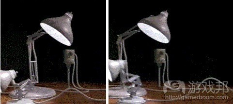 顽皮跳跳灯(from gamasutra)
《顽皮跳跳灯》(游戏邦注:皮克斯1987年制作的短片)的前进动作所体现出的副体是指电源线的晃动,而以此指明跳跳灯来自哪里以及如何移动。 当副体出现在动画中时,它的功能便能够真正体现出来。副体的加入能够增强并推动动画角色的个性。所以,比起通过描绘一个人蹦蹦跳跳去展现他的愉悦,还不如让他哼哼小曲 吹吹口哨。角色在吹口哨时不一定要继续往前走,但是如此一个小动作却能够更好地流露出他的喜悦心情,让角色更加生动。 游戏设计中的应用 在游戏中,次要目标和能量也就是副体的存在。它们可以拥有属于自己的实体形象,也可以拥有美丽的外表,但是却必须与主题紧紧连系在一起,并且无需任何细节描述。它们可 以是游戏主要目标的扩展,或者至少是一些与游戏主题相关的的内容。就像是一个口哨能够用来表现玩家的情绪,调动游戏气氛,但是却没有任何目标性。就其本身而言,副体在 游戏中的分量很轻,甚至可能一点都不重要,就像一块随风飘荡的布匹。但是当副体与一些举足轻重的内容结合在一起时,它便能够用来修饰这个重要的内容,并展示它的重要性 。这时候副体便从一块没有作用的布片转变为旗帜,自豪地充当一种有意义的标志性存在。 在主要行动之前或之后使用次要行动也很重要。但是如果你是在主要行动过程中进行次要行动,它们便会被无情地埋没掉。以面部表情为例子进行说明。如果你的表达方式发生了 变化,那就说明你的思维过程也发生了变化,而如果这种变化是发生在快速移动的过程中,你便会很容易忽视这种表达。所以表达方式的变化必须发生在移动之前或之后,这也是 更好地依附于主要行动的另外一种方式。如果你在主要行动以及重要任务的执行过程中堆积了太多次要目标,有可能会因此给玩家罩上巨大的压力,并让他们混淆了游戏的主要目 标。同样地,如果你在各种能力,武器或机制中附加了太多次要功能,或者在关键时刻突出它们,那么玩家很有可能会忽视他们的存在,因为这时候的他们正关注于其它更重要的 目标。 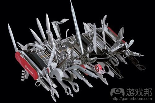 所有附件都在盒面上,虽然它们能够给人们留下深刻的印象,但是真正谈及执行力时,它们只能是不依附于主要物件的副体(from gamasutra)
次要行动总能最先吸引玩家的注意,因为它们具有深刻的情感和视觉表现,很容易让观众上瘾。就其本身而言,它们只能是帮助核心内容吸引关注的次要内容,并且在游戏中不能 占有太大的分量。要记住,次要行动是一面旗帜。它能够体现许多关于人类,国家以及意识形态的内容,但是如果没有旗杆起支撑作用,并帮助它连接起最重要的部分,它就只能 是一块随风飘荡的布片。 节奏(Timing) 动画领域的运用 节奏在动画领域的字面定义是完成某动作所消耗的图像或帧数。但此简单定义有违此原则的真正深意。是的,节奏控制动作或物体的速度,体现内容如何遵循现实世界的物理定律 。这有助于体现比重原理。若量大,移动速度就慢,若量轻,移动速度就快。若节奏过快或过慢,玩家就会错过某些内容。深入节奏原则,你会发现它和音乐存在许多共同之处。 音乐是呈现优秀节奏的惯用方式。没有什么比准确地、反复呈现相同调子更令人心生厌烦。大家喜欢听的是韵律。它令我们跟着打拍子,翩翩起舞,以及进行歌唱。这也体现在大 家的移动方式。不要让玩家按关键帧循序渐进地移动。若你希望他们放缓速度,感受某瞬间,就让他们定格于某姿势。因为与挤压&拉伸类似,你希望得到反差效果。这些支撑内容 是大家所期待的。你希望玩家持续关注动作会以何种方式在何处发生。 动画家将节奏分解成若干不同步骤,这在按关键帧呈现模式中表现更突出。首先,确定自己的核心姿势。你很少会通过这些姿势体验期望的动作或情感。这些是最重要的元素,你 希望能够以最清晰的方式呈现。你希望这些内容能够拥有最佳动作表现力、重要性和表达。只要具备这些元素,你就能够知晓每个内容应持续的时长,然后将其拍摄成系列动画。 这是你把握节奏的地方。获悉某姿势应持续多久,姿势切换的速度。若运用得当,我们不仅能够读懂动作和表现,我们还会逐步发现角色开始变得活灵活现。 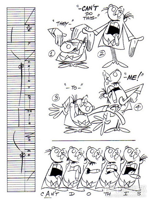 timing face from gamasutra.com
只要定格核心姿势,你就能够制作中间内容。此时你就能够弄清核心姿势主要节奏中间省略的内容。你定不希望均衡地沿着运作弧线设置中间内容(游戏邦注:这就好像在歌曲中 采用四分音符)。你定希望插入若干不同间隔,这是人之天性。 节奏虽然易于理解,但却是最难掌握的原则之一。此处没有普遍解决方案,需靠感觉感知。但你定不希望匆匆绕过此步骤。若你在完整制作动画前通过缩略图或布局完善节奏,将 能省下大量工作,因为角色已设定合理节奏。 游戏设计领域的运用 在游戏设计中,这些节奏实践能够逐一转化。把握何时放缓或加速玩家脚步是我们控制紧急情况的方式。若我们无法丰富节奏,那么玩家的继续欲望就会因出现厌烦感觉而终止。 若他们是庞大而绚丽的角色,那么你投放多少爆炸进攻就毫无关系。若他们没有变更目的或反应,那么敌人的形体规模多大就无关紧要。 但设计优质节奏需极大勇气。这意味着你有时需相信自己能够放缓角色步伐,相信玩家依然会继续投入那些缓慢的内容。在制作游戏过程中,我遇到最多的问题是“加速”理念。 若NPC停留片刻进行探讨,或在操作前花费额外时间进行思考,你定会听到某人称系列事件需更快呈现。这总让我心生畏惧,因为若所有内容都加速,那么也就无所谓快速。所有内 容都非常均衡。当然就另一面来看,若所有内容都非常缓慢和拖拉,那也就无所谓重要内容,因为在玩家看来所有内容都一样繁重。 当面对紧迫时间期限时,节奏是我首先着眼的元素。若能固定节奏,你就能够确定目标。即便你无法瞄准其他所有基本要素,只要能够把握目的,内容依然能够活灵活现。若节奏 很好,玩家能够感觉到。游戏将流畅和自然地呈现,即便边缘有些粗糙,弧线不那么流畅,玩家依然能够完成内容。 上述原则都旨在丰富节奏。预备时长就是所谓的减弱或渐强过程。渐进和渐出所起作用显著,因为你定不希望支撑内容过于单调。出现单调支撑内容是设计师和总监在加速节奏时 所担心的情况。次要动作和运作弧线用于连接各种不同节奏。 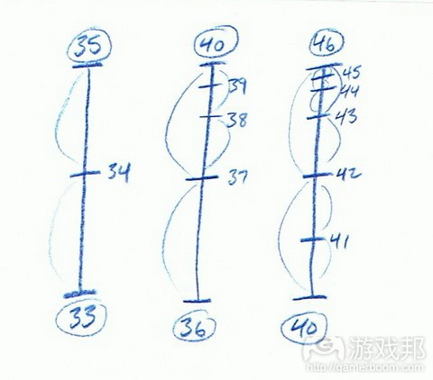 timing chart from gamasutra.com
节奏是带动音乐家、喜剧演员和故事叙述者的元素,是连接观众的生命线。在“加速内容”盛行开发领域的时代,“进行润色”也许是更好的选择。优质节奏和韵律是精髓。确保 游戏核心内容不是系列重复调子。 夸张(Exaggeration) 动画领域的运用 简单模仿生活并不够,通常为真正把握情境、角色情感和核心元素,你需夸大表达或姿势。这是你体现动作或情感力量的渠道。这同样与挤压、拉伸密切相关。把握夸大哪个姿势 或情感非常重要,这样你才能够选择相应情感和身体节奏。若你夸大所有内容,那就失去夸张的意义,很快玩家就会负担过重。 游戏设计领域的运用 在设计领域,这能够有效带来强大机制,带领角色进入某些适合特定情境的体验风格。需要玩家广泛思考其运用的夸大玩法风格或机制能够带给玩家探索感觉,将他们带入更有益 的实验过程。若你的机制非常稳固,大可尽情在游戏进程中进行夸大。这意味着你将愉快地设计某些效果显著、富有粘性的内容。这随后变成玩家能够最大限度地从中获得乐趣。 起初深入过度,最后再绕回去的情况要好过不够深入。只有过度强化内容,令其破坏机制,你才能知晓其中极限。将夸大内容呈现給玩家能够赋予他们权利感,让他们觉得自己操 作的内容非常庞大(游戏邦注:这需确保预备和贯彻内容相对应)。 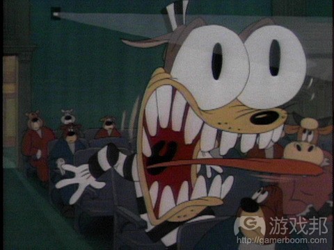 exagg wolf from gamasutra.com
通常在有机会运用挤压和拉伸时,人们倾向走极端。这促使相关负责人怯于拓宽这些原则的运用空间。但这不是说要完全消除这些原则,而是要鼓励大家进行负责任的运用。若角 色、道具或机制的目标非常清晰,那么相关工作人员就会尊重其目标,只进行适度夸大,令其能够引起情感共鸣。但若你排除这些原则,相关工作人很快就会变得拘谨,冷漠看待 其真正的潜力。通常你很难达到真正的目标,通常是略低一等,因为他们害怕触及真正极限。 排除这些原则会令作品和创作者迅速丧失生命力。此原则旨在超越虚拟现实,创造真实感。通常我们的感觉、思维和情感都是现实的夸大版。此夸大方式令虚假、不真实的表达变 得真正可信。我们需注意不要进行不真实的夸大,令内容变得过于戏剧化,超越极限。  exagg cry from gamasutra.com
所以虽然这些工具对开发者而言非常重要,但我们需留心其运用方式,不过超越极限。因为可信性是真实夸大的必要条件。 手绘技巧(Solid Drawing) 动画中的应用 说起手绘技巧我们总是会直接联想到手绘动画,但是现在这种技巧也成为了电脑动画的核心理念。这意味着你必须了解你的描绘对象。在让他们移动之前,你必须知道他们静态的 样子。你必须知晓他们的形状,结构和用途。你也必须清楚要使用何种道具,即你必须拥有一根合适的铅笔,并使用它勾勒出形象的角色。所以铅笔就像是钻探设备或者程序包一 样的工具。但是如果从更深层次来看,你就必须先了解你的角色。知道他们的个性,背景,以及他们要说些什么或者什么时候说这些话等等。你必须深入探析他们的想法,真正了 解这个角色。也就是说你不只需要描绘他们的外观,还必须理解并传达他们的情感。 这里涉及的就是所谓的体验派演员以及他们所拥有的演技。而在这里,演员变成了屏幕上和屏幕外的角色。他们要去体验自己所扮演角色的生活,但是如果过于极端,他们的生理 和心理都会受到严重的影响,但是也正是这种体验派演技才能真正展示出我们所理解的生活面貌。 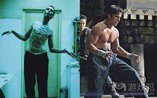 method_bale(from gamasutra)
如上图,不管怎样,当你看到Chrisitan Bale(游戏邦注:2011奥斯卡最佳男配角)所诠释的角色时,你都会深信他就是那个角色。 游戏设计中的应用 所以我认为我们必须成为体验派游戏开发者。将你所幻想的场景表现出来,刻画出你希望玩家能够控制的游戏角色,尝试并使用真实生活中的道具或武器以获得同等的触觉感受, 尝试再现脚本中的情节,并观察自己的反应。看看自己在遇到类似问题时会有何表现。在你设计完整的游戏关卡之前花点时间去进行这些过程。因为当你亲自感受到游戏高潮时, 才能真切地感受到角色在游戏中的表现。而借此你便能够更好地协调角色,玩家与叙述之间的关系。 如果你正在创造一款战争游戏,你就必须让整个军队团结在一起,并设置软弹气枪或者彩弹球场景,以便让玩家能够更深刻地感受到游戏高潮,无论那时候他们是奋力奔跑还是匍 匐前进。你必须了解匍匐前进并开枪射击的感觉。如果你的游戏角色背着一个很大的双肩包,那么你就必须亲自背上一个大背包,去感受这种累赘和沉重感。如果你正在创造一款 紧张可怕的游戏,你可以去鬼屋感受这种气氛,并观察鬼屋里那些“鬼怪”的移动。所有的这些时刻和体验都将帮助你更好地理解游戏情境,虽然你不能直接面对游戏角色,但是 却能够通过类似的行动去感受类似的情感。你必须在现实世界中尝试任何你所创造的体验,因为只有亲力亲为的体验才能更深刻且更诚实地刻画出这种感觉。  dukakis(from gamasutra)
如果设计者自己都不满意场景设置,或者对其一点都不了解,那么这种场景很快便会失去可信度。 如果你在早期游戏原型或者关卡设计时便开始执行这种方法,你将能够更好地了解角色在不同关卡的不同表现形式。你将会清楚他在数字和物理环境中的反应。而这也是玩家所能 感受到的。所以,当你需要解决问题或者重新设置一个新动作时,请不要闭门造车,最好多体验现实生活,因为这些体验才是真正对你有帮助的真实感悟,是具有真实感的情感体 验。 吸引力(Appeal) 动画中的应用 吸引力是任何人接受一项事物的最终原则。角色设置必须合理可靠,必须能够表达情绪,并且引起观众做出情感反馈。而这些都必须通过有趣的视觉设计,图形和外表特征表现出 来,特别是在不对称与对称设计和行动中更能清晰地表现出来。而所有的这些过程都是为了创造出具有视觉震撼力的角色,而不只是创造外表讨喜的角色。你的创造物不应该只是 停留在外表吸引层面上,作为一名创造者,你同时也应该创造那些让人厌恶的角色,但这并不是指一个无趣的角色,而是一个虽然有缺陷,但却是非常真实的角色。而观众是否会 对你的产物“一见钟情”或者是否愿意投入更多的情感,都取决于他们自己。因为如果你的创造对他们具有吸引力,他们便会敞开心扉真正去感受你的创造。 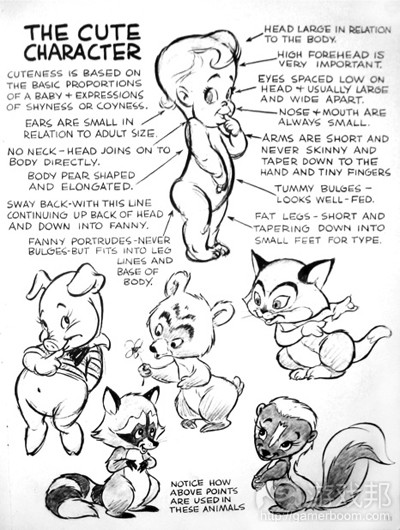 cute character(from gamasutra)
角色设计中的任何一块细节都是为了让观众拥有一种特别的情感。而在游戏设计中也需要关注于这种细节。 游戏设计中的应用 可以说,吸引力就是游戏的一切。在游戏设计中,我们的任务是将玩家与游戏世界和游戏角色融合在一起,带领他们感受游戏情节,面对各种难题等。而如果我们不能够吸引玩家 的注意,让他们真正沉浸于游戏中而不只是麻木地操作游戏,那我们便不配作为具有发展潜力的创造者。如果你的角色不能达到预想的效果,你就必须创造出一个具有视觉震撼的 世界,或者让人满意的游戏逻辑。如果我们不能让玩家真正愿意将情感投入于故事情节或角色中,那么玩家的游戏体验就只能像是猴子按压键盘那样毫无目的,麻木无感了。而我 认为这么做对于玩家和开发者来说都是非常失礼的。 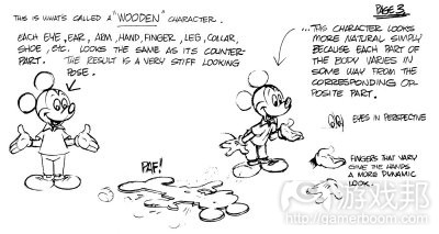 mickey mouse(from gamasustra)
动作或姿态的不对称能够在任何情况下快速吸引人们的注意。而在游戏中,关卡或游戏机制的不对称设计也能够让玩家在不同情境下感受到不一样的感受。 作为一名游戏开发者,创造出具有吸引力的游戏体验的第一步便是,满腔热情地投入于这种创造工作。只有对自己的工作充满激情,你的创作才能备受感染,并且因此将这种情感 传达给玩家,调动他们的激情。而如果你总是抱怨这种工作的艰难与困苦,那么玩家感受到的也只能是各种沉重感了。不论是缺少激情还是热情洋溢,都能完完全全地体现在你的 创造中。而如果你必须花费几周,几个月甚至几年的时间去创造游戏,那你就必须确保自己在最后还能够保留住最初的那份激情。你可以出去旅游,听乐队演奏,玩乐高玩具,或 者参加一些简单的比赛等,重新找回沉浸在内内心深处的那份热情和童真。因为只有当你感到兴奋时,你才会更加乐意去尝试新挑战,并创造出真正具有吸引力的内容。 为了获得真正特别的吸引力,你还必须使用一些其它原则。在这里不存在任何捷径,你必须尽可能地尝试一切原则,并判断哪一个才是对你最有帮助,从而根据你的选择朝着正确 的方向前进。你应该创造出一种游戏体验能够真正萦绕在玩家情感中,并且时刻提醒着他们再次回到游戏中。你还必须牢记的一点便是,绝对不能构造虚假的吸引力,这与你难以 假装自己很有魅力是一个道理。不论你尝试用何种方法去掩盖缺少的那部分吸引力,也不可能瞒过玩家的视线。如果你的游戏不具备任何吸引力,玩家将会很快对游戏失去兴趣, 并最终放弃游戏。不论你的游戏多么华丽,只要缺少吸引力,玩家就会迅速退出游戏。游戏中任何一个无吸引力因素都能够轻易地阻碍玩家的体验。缺乏惯性跟随的动作,渐进渐 出设置极差的迷题,或者节奏混乱的关卡设计都有可能让玩家对游戏失去兴趣。 只要你愿意进行详细的规划和探索,便能够挖掘出任何事物的吸引力。当你在创造任何新事物时,一定要花点时间去尝试所有原则。学习并研究这些原则,努力变成一个能够创造 出自己设想目标的方法开发者。你必须了解你的角色以及游戏机制,并且知道如何将其融入到游戏中。你必须知道什么时候或者如何在游戏中安插一个让玩家感到惊喜的机制,并 且能够将这些因素与游戏完整地结合在一起。你可以在一个适当的地方安插次要行动,以此优化游戏的核心体验。而这一切都是关于传达你的创造意义和真理所必须的步骤。 仔细思考后再开始创造。否则你的创造物中将只有空气,没有灵魂。 相关拓展阅读:篇目1,篇目2,篇目3,篇目4,篇目5,篇目6(本文由游戏邦编译,转载请注明来源,或咨询微信zhengjintiao) Adding Weight to Your Game Design Michael Jungbluth Intro Weight is a physical and emotional sensation that people feel everyday. And conveying that in a visual way can be incredibly challenging. But it is something animators do all the time, and the principles they use can be applied to game design. In fact, it needs to be, as many of these principles are sacrificed by the animator for the good of playability. Thankfully, since both animators and designers have to juggle multiple disciplines to bring their creations to life, they speak much of the same language. They just use a slightly different alphabet. Each part will lay out the 12 principles of animation, and how they are not only used in animation but how they directly relate to game design. Both animators and designers will realize quickly that many of these are unspoken truths, but the benefit comes in knowing that they can now speak to each other on a deeper level. A level that takes animation and design past being purely functional, but now fully functioning towards creating an honest experience. It is how both can add an extra sense of weight and purpose to the game and the characters within it. Many of these fundamentals are inter-connected, and it is through a combination of all of these working together that you will have characters that move with weight and emote with weight. And that is what will stick with players. “It is important for the animator to be able to study sensation and to feel the force behind sensation, in order to project that sensation.” – Walt Disney Squash and Stretch Applied to Animation This is the most visible expression of weight and the first thing animators learn and love. The easiest way to show this is with a ball bounce. Instead of just having a static circle bounce up and down, to show weight it will stretch as it falls, squash when it lands, and then stretch again as it travels back up. That movement of mass throughout the object visually defines how the body handles its weight. When applying this to a character, think of a jump. Before they can lift off, they must first compress down, to store all that energy like a spring. Then when they take off, they stretch wide, no different than a ball bounce. But this is also done in facial animation. If you want to make a scream feel powerful, have the face scrunch up, with the characters eyes closed and brows furled. And even for small moments, you want to feel it, even if you don’t see it as much. Because again, this is how people will perceive how the body handles and distributes its mass. The biggest pitfall of squash and stretch, when used sloppy, is that the object or character will change or lose volume. And that is the most important thing to remember, the overall weight/mass of the object must stay the same when at rest, stretched and squashed. Changing mass means an instant loss in weight. Applied to Game Design In game design terms, squash and stretch is essentially contrast. Let the game store up, coil, for what is about to come and after you have done so, let it loose on the player. Make sure when leading in and out of each action, they feel the stretch. Stretch their abilities, stretch their resources, stretch their economic investment. Then let the impact of the squash take over so the player can see just how much weight and mass they have been carrying around. Because without lows, you can’t have highs. And vice versa. This contrast is the core of what will not only make the player see the weight, but more importantly, FEEL it. If you can build contrast into every action, no matter how minor, you will be creating a sense of weight in everything the player does. Just remember, that volume can not change. This will give it solidity, no matter how far you push it. This will give whatever you are creating truth. The easiest place to put this to practice is with guns. If it is a low powered, rapid fire weapon, then the stretch and squash will be minimal. Now think of a gun that allows you to charge the blast. The longer you charge it, the more powerful the blast. You are squashing the power to its limits, so the blast can stretch out into a beautiful ballet of destruction. In both instances, you will instantly feel how much general squash and stretch is needed. But fine tuning them to feel right, beyond just look right is the key. A common tip animators give is that it is easier and faster to push it too far and pull back, then to not go far enough and keep incrementally pushing it up. I’m not saying shoot for the furthest star in the sky, and pull back to the star closest to you. Go into it knowing which star cluster is the one that is probably the best fit, and aim for the furthest star in that cluster. Because as time goes on, things naturally tighten up and get pulled back as you polish your creation. Now with player controlled characters, this principle is something that is quickly sacrificed, as taking the time to squash means taking the control away from the player for a moment, while they are stuck in place, storing the energy that is about to released. But there is a tactile squash that the player feels when they press the button on their controller or click their mouse. That can be a great step towards making the player feels the squash, even if they can’t see it as much as the animator might like. Squash and Stretch are the easiest way to quickly add weight to anything you are working on. And because of that, it can also be a favorite trick for people to use and overdo. But as long as you keep the core of the creation truthful, and care first and foremost about the feel of each over the visual, it will always be a solid method towards conveying weight. Anticipation Applied to Animation In every action, you have anticipation. This may be the most important tool animators have when it comes to storytelling and action. And at its core it is one principle that is most commonly used by game designers. Not only is anticipation in every action we do, and needed to convey a sense of weight, but it is also used to draw the attention of the player before an action happens. For a visual example of anticipation, think of a baseball pitcher. First they will wind up before they even release the ball. Without anticipation, actions become confusing and lose weight without anything to describe HOW they get to where they were going. Anticipation is also the first step in getting the player invested in what is going to happen as they actively engage their mind in the possibilities for what is coming next. And that is an incredibly powerful tool to have when trying to convey a story, movement or emotion with any sense of weight. Applied to Game Design In games, anticipation is most visible and commonly used with enemy attacks. To really have a powerful hit or to get the player invested in what is going to happen next, anticipation is employed. The enemy will rear back and give the player a tell, to let them know what is coming. Visually the twist, torque, and shift of their whole body weight makes what is about to happen feel powerful. But it also engages the player to think about when the attack is coming and how best to deal with it. And those moments of drawing conclusions and problem solving is why people play games. Without anticipation, there is no weight to any action that takes place within the digital world or the player’s investment into the world. And the longer you anticipate and build up the action, the more powerful the implied action is expected to be. Likewise, smaller anticipations mean smaller payoffs. You can see how anticipation builds directly from squash and stretch. Anticipation is also when you can also add a lot of character and personality to the action or mechanic. This is a big reason PunchOut is so successful in not just creating memorable characters, but also great gameplay. The anticipations perfectly match in visual, payoff, gameplay and personality to craft fully fleshed experiences. If a character anticipates, it shows they are thinking about what they will be doing next. If they anticipate in a unique way, it gives some sort of insight towards HOW they think. And giving a thought process to a character is the number one way to make them feel alive and aware of the world. But beyond just conveying the actions of a character, it is also used to prepare the player for something that is about to happen. Think of the age old tactic where you let the player stock up on health before a big encounter. When you come across a big cache of ammo and health, you anticipate a big battle. And because of it, you better deliver a great battle as a designer, because they are aware of what is coming, and in their mind are already starting to come up with an idea of what it could be. And that is the sweet spot, because you have engaged the player’s mind to start thinking through the rules of the world and piece together a solution to a problem that hasn’t even been posed yet. And while it can be very satisfying to match or beat those expectations, it isn’t always about delivering on that expectation. You can build something up, but then flip those expectations on their head. And if it is appropriate to the anticipation, it can be even more meaningful. In fact, any successful twist is playing on those pre-conceived assumptions associated with the anticipation. The action can also be smaller than the anticipation, which is a staple of the comedy genre. Take the pitching analogy of before. Think of the Disney animated short where Goofy begins an elaborate wind up, building intense amounts of energy, only to finally pitch the ball by gently flicking it forward. Over the top, and slightly cliché, though still good for a giggle. But, when done subtly, it should be felt by the player, not seen. If it is too much, it will pull the player out of the game, because it will no longer be believable. If you have none, they will be pulled out because it doesn’t feel real or attached to the rest of the experience. But both have to be rewarding to the player
and the payoff needs to match the anticipation. This is one of the most powerful tools in our box, as it is entirely built around involving the player. And because of that, their investment is immediate and our ability to deliver can go beyond just narrative or visual payoffs. Their investment means they can react to the anticipation and either allow it to play out, or change the outcome. And for those changes to have weight, not only do the repercussions need to be meaningful, the anticipation leading up to those player choices is what will make them care about getting the chance to make them in the first place. Staging lets the player know what in the world has the most weight. This means you must know what you want to tell the player, and have everything else frame that focal point. Clarity is the key and being aware of the entire scene is essential. In animation, this means everything on the screen and the performance needs to be designed to keep the focus on what is important. The environment, the pose of the character, the way they motion with their hands, where they look with their eyes… it all comes together to focus the player ’s attention on where and what is important. Even without words or sound the player needs to instantly understand and connect to what they are seeing, and clear staging is the key. Staging is also how you can psychologically impact or deceive the player when the character or scene’s deeper intent is not what they are being lead to believe. How you tilt a camera or place objects in an environment can quickly make the player feel a sense of emotional weight in a very subtle way.Applied to Game Design In game design, think again of the whole scene. Think of where the characters are standing. Think about the lighting. Think about the placement of power- ups. Think about the clutter, and the definition of shapes surrounding the environment. How does a long corridor with lots of debris feel compared to a wide open room? When in a forest, think of the difference of having gnarly, spiney trees vs towering redwoods or young, sprouting saplings. Figure out your intent and theme, and everything else should lead to what is most important at that moment, to the level, and to the narrative being delivered. Then after you have established those major points, make sure everything else in the scene supports that focus, and does not compete with it. Because when they compete, that is when you get players confused on where to go, what their objectives are, what a mechanic is used for and what to do next. And once you or your game are no longer clear of what you want with the player, they will lose their investment on where they fit in the world. And once investment is lost, getting the player back is harder than establishing it in the first place. This isn’t to say you can only have one thing going on at a time. Just stage the most important gameplay elements for the player as the core. Make sure both you and the player are focused on what tool or mechanic best fits the situation, and have all the other elements and mechanics support and frame the focus. This will make that element feel stronger and carry more weight in the world, which will organically connect the player, the game and the designer. Depth and space are big parts of staging. The quickest way for a character on a 2d screen to look like it is immersed in the world is to layer the poses and performance depth. Animators do this through overlapping body parts, being aware of the negative space throughout and around the body, and making sure their silhouettes read. They think of the foreground, middle ground and background, and pose the character in a way that the depth makes the focus feel all the
more supported. This same attention to depth needs to be defined in your core gameplay. You don’t want to have all your mechanics be at the same depth in the same scene. Layer them, so that some are in the background, receding into the back of the players mind and others are at the forefront. This is especially key when introducing new features or upgrades to a mechanic. This could also be used for the mechanics that are second nature and always in the background. They can be instantly identified without too many details if you have something in the foreground that requires more attention, such as a high level mechanic that requires more concentration from the player. The quickest way to see if your staging or pose works on animation is to reduce it to a silhouette. And this is something game design can benefit from a lot. What you are essentially doing is getting rid of the white noise. It helps you get past all of the details. It says, can you read and understand what is going on with just the most minimal of information and is the core strong enough to stand on its own. Is the character or emotion instantly recognizable based solely on the shapes. This can be done with game design in many ways. Build the game with rough geometry to make sure playing through the area is fun even without the art. Without any lighting, see if you can frame your level in a way that leads player in the direction you want them to go. Keep characters in T-pose to see if you can build the scenario you want without adding elaborate animations. Can you make a chase feel tense based only on the speed & timing of the enemy, without all the sprints, jumps and tackles? Can you make your environment come alive with the proper placement of T-posed characters pathing through the world? Because if the silhouette of the game is strong, then everything the player does in it will have weight. If players are getting lost, either on what to do next or just losing interest in general, checking your staging will go a long way to figuring out why that is. Either your performance is being lost or your core gameplay isn’t being framed properly by the rest of the experience. But if you always keep in mind your staging, and always ask what is the focus of the moment, both you and the player will be able to move forward. And when you have everything staged properly, the weight of everything you create will be easily defined by everything else around it. Adding Weight to Your Game Design Part 4: Straight Ahead & Pose to Pose Straight Ahead & Pose to Pose Applied to Animation This principle is all about process. It is two different methods used for finding and creating the character and purpose in a performance. In animation terms, straight ahead means just starting at the beginning, and fleshing it out as you go along. You don’t have much of a road map & you are allowing it to come out organically. It means staying in character throughout and keeping the purpose at the front of your mind at all times. It is the ultimate juggling act. Because if you aren’t careful, your timing can quickly fall apart, your actions become inconsistent, and your character loses its truth… its digital weight. Pose to pose means you are figuring out the major beats of the performance or action up front, and roughing out all the parts at once. This means the poses you focus on are very strong and you can quickly see how the whole thing plays out. Once you get those nailed down, you can then focus on making sure everything in-between links up smoothly. You make sure each pose & each expression you create and time out hit the marks you want. Where you have to be careful is keeping it from becoming so planned that it becomes mechanical and loses the energy of the performance. And once something becomes mechanical, its weight will be questioned. As you can see, neither are the magic bullet but both offer great solutions when creating something with true weight. Applied to Game Design In game design, the two methods translate almost perfectly. What it really comes down to is known vs. unknown, and much like animation, the best results come from using both methods, as the case demands. Planning on paper is pose to pose. You try to identify the major systems and solutions on the page so that you can get the core in quickly, fleshing out what comes in-between after it is firmly established. This works great when you have a larger team coming online, as it is easier to show everyone the big picture when you have it mapped out. You can keep that map out for everyone to see, and everyone knows where their piece fits. Having those core beats, moments and mechanics instantly keeps the vision alive for everyone involved. But when something can’t be worked out on paper, it can be best just diving in and organically working it out along the way. This is using straight ahead, so that you can play test the unknowns to find out which work. This requires a lot of communication, overall understanding of the creations purpose and trust amongst all the disciplines as no one person can create everything on their own. This is the ultimate jam session, and everyone involved needs to understand the other band members. This is where the most ownership comes from, and where some truly energetic and organic creations can come from. But also where the most chance for failure can happen. It’s essentially performing without a net. You never feel more alive, but if you make a big mistake, you will feel it. Knowing when to use which method and the strengths and weaknesses of both is the true fundamental. And in both cases, it takes a great leader to identify which method works best and that the vision remains consistent throughout. If you only use pose to pose in your development, the team can feel like a cog in the machine. But if you only have a straight ahead development, you can quickly find that the parts don’t match, and you have mixed visions. But beyond managing teams, this can go for designing a level, upgrading player’s moves, or building more complex puzzles through out the game. Any time you have to create something, you will be somewhere between these two options. And it really is a mixture of both that yields the best results. When you encounter the unknown it is best to think from pose to pose, so that you can figure out how to make it work. This gives you a chance to learn and experiment on the key aspects, until you feel completely sure of their strength. Then go to town and do some straight ahead game design to link those posed out actions or features. This is the point where you know your tools, you know your intent, and you just let it flow and allow your subconscious to come out and play. When scrum is working as is intended, it embodies this idea perfectly of merging the two methods. Innovation can be found in both though. For large innovations, it is usually something that tries to be harnessed first by thinking and talking about to grasp the initial kinks. You try to pose it out as best you can to answer your questions. And it is through straight ahead that you can find meaningful iterative innovation. It is those small surprises that appear when you just let yourself go that just feel really good. But it is through using both that you will focus on maintaining the weight of your creations. Whenever you have an action, it must always carry through to the next, and different parts of a body or performance move and stop at different times. How and when they stop shows their weight in direct relation to one another. Often times these two terms are used interchangeably but there is a subtle difference between them. Follow through means that separate parts of an object will continue moving after it has stopped. Overlapping action is the tendency for parts
of the body to move at different rates and how that can be used to fluidly lead from one action to the next. Let’s start with Follow Through. Think of energy. It can’t just stop. It has to transfer through, and past its destination. This follow through is what gives a sense of weight and connectivity through the body and performance as well as showing the player where the action originated from. In animation, lets again refer back to the jump. When you land, your body doesn’t just stop, even if you appear to. Even as your hips land first then rise back up, you compress your spine and your head begins to arch down. Your arms also drag behind, continuing the stretch into the squash. Those movements are the natural follow through of each body part. Now imagine as the character is landing, he goes into an uppercut. As his arms are falling, dragging behind and up above the rest of the body with the fingers open, they arc down, ball into a fist and then slam into the action of the uppercut. They don’t actually stop at any point in the action, but flow seamlessly from one action into the next, from trailing the body towards helping propel it into the punch. And that linking motion is the overlapping action. Overlap of movement and performance is what brings a character to life and makes them look and feel alive. Without this, they are just a machine, going from one task to the next, losing all sense of emotional weight or soul. Applied to Game Design In game design, this means whatever the player does, or whatever happens in the world, it must have repercussions. It must go beyond just what was completed and towards what is going to happen next. Actions should link up, and what you just did affects what you are about to do. It doesn’t always have to be in the players face, but it must be felt, if you want the completed action to have any weight. And it is the repercussions of those players actions that is follow through. You shoot and your actions follow through into the world through either bullet holes, injuring an enemy, or blowing up a propane tank. In fact, this is the ultimate key to immersion. And while crafting a world with player freedom in which every action and decision has the same follow through as physic objects is a Herculean task, like every principle, the key is to feel it, not just see it. It can be in a simple audio cue. It can be in a slight head nod. Because like other principles, the follow through must match weight of the action. Heavier parts lag further and stop slower that something that is
light. This is what defines weight and truth in actions. Follow through is how everything reacts to what just happened, but it doesn’t always have to overlap into something else. In fact if everything is overlapping it becomes chaos. The overlap is reserved for what will be driving the next mission or action, to help the player feel what is essential to the experience. Without overlap, actions are hollow. Overlapping the outcome of one mission and how it leads into the next can make something as silly as going from an amusement park to the moon feel legit. It is especially important with NPC AI if you want to create a living, breathing world. It is the transitions, turns and look at commands that give the appearance of a thought process in a character. Unfortunately too often those are the first parts to be scraped or rushed when working on a character because they are boring to animate and are treated merely as a service to the progammers. But without the overlap of those transitions, NPC’s really become nothing more than pathing AI bots, which are hard to believe as actually moving around the world with any purpose. When designing an area, be aware of what your NPC characters could be doing there. When requesting a change in attack state, think about WHY they would do such a thing. This starts with anticipation, but without having that follow through, the anticipation will fall flat. Follow through is the squash to anticipation’ s stretch. And if there is ever a time you can’t anticipate something, follow through is your golden parachute. If you want to move something very big very fast, you can cheat the sensation of weight by skipping the anticipation but making sure there is a lot of follow through to accommodate moving something of such a large mass so quickly. So even if it takes off like a bullet, give it the follow through of a train to maintain that sense of weight with all its other actions. Overlap and follow through are what transform player interactions from being a mere skinner box into a deeply rewarding experience. If the use of achievements, trophies or badges are the only form of follow through we give out as developers, then we are not holding up our end of the conversation with the player. Follow through and overlap is how we answer a player’s question of with a sense of purpose and weight. Slow In, Slow Out Applied to Animation There is nothing worse than a jarring stop, or sudden change in direction to quickly take you out of a performance or action. Nothing ever truly comes to a complete rest, (unless it is dead) it is just moving at different speeds between one action and another. This principle also shows how heavy something is by how fast it starts or stops. In every action, there is some settle after something happens, or before it is about to happen. The first exercise every animator learns to illustrate this point is a pendulum. Throughout the middle of its trajectory, it moves very rapidly. But as it nears the apex of its arc, it slows down a bit. There is some friction there as gravity begins to pull it back down. And both before and after the apex, it loses some momentum. Until again, it begins to fall, at which point it picks back up. And while the word slow is in the name, it also defines how quickly an object moves to and from a state of rest. This principle again builds upon squash and stretch, but beyond that it is what allows the player some time to feel and see the pose without it becoming static. It gives the animator time to transition from one pose to another and makes sure that the important poses are seen without them coming to a complete stop. This allows the action to read clearly and still feel alive. Depending on the action, animators can either ease in or cushion in. Ease in is just slowing into the pose like the pendulum shown above. Cushion in slows in, but then overshoots a bit before it settles back into the pose, like a car coming to a stop. Depending on the weight of the object depends on which is used, and the difference of both can be felt. Applied to Game Design In game design, it is easy to see the translation. With goals, the player should be gradually eased in and out of each task they are asked to complete. The complexity of each puzzle should be eased into. But a new gameplay mechanic can be a great way to cushion in. Give the player a new enemy to fight, by building up and slowing into that first encounter, then slightly stretching the next encounter to up the challenge, and then settle back so that they can feel a sense of mastery. The same can be done with a new power, as a way to let the player feel like they are exploring it a fair amount on initial discovery without overloading them with too much information. Just remember, weight matters. When you slow in and out a great deal, the player will assume that it is something of importance, because you are keeping their focus on it. If you give it only a little ease in and out the player won’t have enough time to truly become attached. The level to which you slow in and out is the hard part to master, and that is what play testing is all about. Is this action too sudden and confusing? Then you need to slow out of the last action. Is the player lost because we didn’t give them enough time to digest what is happening at this moment? Then they need to be slowed into it so they can take it all in. Is this part not explosive enough because it is too slow and taking too long to get to the action? Slowing in and out is what gives each action weight, and what dictates their importance. If either are off, then the weight and truth of the game will be lost. And when the slowing in and out becomes too obvious or slows down the overall gameplay, use some overlap, because remember, everything is connected. Slowing in and out allows you the time build in the overlap without everything becoming too hectic and disconnected. Slowing in and out is the moment when the character is devising a plan. It hasn’t entirely anticipated the next action yet because it hasn’t decided what that next action is. It is what is going on as the overlap and follow through are taking place. And that is an important moment. That is the moment when things begin to stew. That is the moment when the pieces are being put together. That is the moment and sensation we are developing for the player with almost everything we do. We want them to think about what they are doing, what they are going to do, what they want to do because that is when they are fully invested and part of the game. And when they ultimately respond to what the game has asked of them, they will have had time to truly feel like they made a decision, and not just an action. That is the moment when both the game and player are occupying the same space and sharing each others weight. This is the principle that probably everyone has some knowledge of. One of the quickest ways to rob something of feeling fluid, organic or alive is to move it in a straight line. Sure, straight lines may be the fastest way to get from point A to point B, but they are also the most boring. They are all about the destination, and care nothing for the journey. And that journey is where you find growth and meaning in a character. In animation, think again of the pendulum. It doesn’t move from apex to apex in a straight linear fashion. It drops in the middle, creating a beautiful arc that gives it weight, and fluid motion. Arcs are what animators love more than just about anything else. It is pure beauty in motion and what makes the movement between key poses fun to watch. The extreme of the arc conveys so much, be it big and grandiose, or small and contained that is impossible not to enjoy the path that gets you there. It shows the personality of the character and leads the eye through a smooth ballet of motion. Likewise, lack of arcs is how you can make something feel cold, weightless and mechanical, which is useful when animating a robot… or Spock. A page demonstrating arcs during body movement from the Animator’s Survival Kit by Richard Williams. Notice how there are in every part body parts movement, even the hips. Applied to Game Design In a narrative sense, this principle is a no brainer. This is the classic narrative arc that everyone learned in grade school. A character or story arc is the fundamental of creating a strong narrative. Every character & story must have progressive challenges that allow them to grow. And as those challenges increase, they reach an eventual climax, which is then resolved. And in game design, arcs can work much the same way. It means you are starting the player on a journey, or growing a game mechanic organically. As they move forward in the game, it builds, and builds until eventually some sort of resolution is required to make it feel complete. Often times, this means adding more power or functions to the mechanic until it maxes out. But at a certain point, you need to know when to pull back on how much is too much, and allow the player to digest everything you have given. As this mechanics arc is pulling back, the player will feel comfortable, and more than willing and capable of digesting the next mechanic’s arc. Arcs are what link everything together towards a complete and final point, as well as how you create beautiful and flowing overlapping action. But be aware of the staging of your arcs to make sure that the one with the biggest arc is the most important at that moment or to the overall game. Everything else needs to have smaller arcs that will not compete, but flow seamlessly compared to the larger one. Notice the hierarchy of each arc and how the smaller help to hold up the main story arc. If every enemy, weapon and level can have an arc, no matter how small, they will feel far more connected to the world they reside in. And it will give each their own history and experience, making each feel like a fully functioning element of the gameplay experience. In most cases, this already happens on a regular basis. When you encounter a new enemy in a game, there is usually a unique intro for them, which is the beginning of the arc. You then fight them, through different attacks and stages, until finally you defeat them, which is the climax. At which point, you want a death or surrender that matches the arc leading up to it. This works exactly the same with puzzles. You establish the layout and tools. You allow the player to face each step of the puzzle, growing the challenge, until they complete it. And just completing a satisfying puzzle is often times the resolution to the arc for the player. If built up properly, and fluidly, then the resolution will resound strongly for the player. But remember, when leading a player through an objective or level, that the straight path will always feel the most mechanical. Let them feel the organic flow of an arc as they go through a level. Like a roller cost, let the dips take their breath away while the hills make them hold it. But keep the arcs clean and fluid, so that it feels effortless. Because the arcs are where the beauty lies and different points in an arc carry different sensations of weight. The moment you nail the arcs is the moment you can get lost in the motion and just naturally feel it flowing throughout everything you do. And that
is the moment that the player and the game become a seamless unit. Adding Weight to Your Game Design Part 8: Secondary Action by Michael Jungbluth Secondary Action Applied to Animation Secondary action in animation is everything from hair, to capes, to tails, to flags. It is the parts that aren’t necessary to the core action, but add extra visual flare. When you look at a person, the root of the body is the main action, and everything else is secondary. It is ambient, but reliant on whatever it is tethered to. It is the icing. It is also a great way to see where the weight of something has just come from or where it will be going as secondary actions are often very light and almost weightless. In fact, a lot of secondary action is shown by using follow through and overlapping action. The secondary action of Luxo Jr’s forward motion is the rippling of his power cord which shows clearly where he came from and how he moved. Where secondary action really becomes powerful is when it comes to acting in your animation. The secondary action is what can be added to help establish and push the personality. So instead of just adding a bounce to the step of a happy person walking, you can also make them whistle. That whistle isn’t necessary for the character to continue walking, but it helps to establish their pleasant mood and makes them feel even more alive. Applied to Game Design In games, secondary objectives and powers need to work the same way. They can be their own entity, and they can be beautiful, but they must stay tethered to the main objective and not become so elaborate that they distract from it. They should feel like a natural extension of it, or at least something that is relevant to the main purpose of the game. They should feel like that whistle, adding to the overall mood, atmosphere or purpose, but not necessary for that purpose to go on. In and of itself, it is very light, and almost weightless, like a random swatch of cloth blowing through the air. But, when attached to something more substantial it helps to define the form underneath or trail behind showing off just how much power it is attached to. It is transformed from being just a random piece of cloth floating in the air into a flag, proudly displaying any number of symbolic and meaningful messages. Think of any secondary mission or quest that quickly grew repetitious. More than likely it had you collecting something you didn’t care about and in all honesty the game world itself didn’t care about it either. That is probably because it didn’t match the main action of the game. Because without that anchor, secondary actrions are lost to the wind, aimlessly floating in an ocean of meaningless grind fests. It is also important to use secondary action before or after a major action. If you try to use them during a large main action, they can get lost. Take for instance a facial expression. If you have a change of expression, which is signifying a change in thought process, during a fast action, it will be lost in the motion. The change in expression should happen before or after a move. This is just another way to keep it tethered to the important action. If you layer too many secondary objectives during a major, important quest, you will run the risk of overwhelming the player & having them become lost as to what is really important at that moment. Likewise, if you give a power, weapon or mechanic too many secondary functions, or introduce them during intense moments, the player can miss it because they are too focused on what needs to be done immediately. Imagine each attachment is a bullet point on the back of the box. Sure, the back of the box looks impressive, but when put into effect, this is all secondary without any primary to hold it together. The secondary action is often what players notice first, and often times is what they are instantly drawn to. Because they are so emotionally and visually loaded, its easy to overdose on them. But they themselves are only a way to help add attention to the weight of the core, and should be only heavy enough to not get lost in the rest of the game. Just remember them as a flag. It says a lot about the people, country, and ideology of where it is located, but without a flagpole to attach it to what is really important, it is just a piece of cloth floating in the breeze. The literal definition of timing in animation is how many drawings or frames it takes to complete an action. But that simple definition betrays how deep this principle truly is. Yes, timing controls the speed of an action or object, showing how it respects the laws of physics in the world it inhabits. And that helps to define its specific weight. If its big, it moves slow, if its light it moves fast. And if your timing is too fast or too slow, the player will miss what it was that just happened. But when you drill down deeper into the principle of timing, it shares a lot in common with music. Music is the universal language of what good timing is all about. There is nothing more boring than the same note being played over and over in perfect time. What people love to hear is a rhythm. It moves them to tap their feet… dance… sing. This is also true with how someone moves. Don’t just make them go from pose to pose, one action right after the other. Make them HOLD on a pose if you want them to slow down and feel the moment. Because much like squash and stretch, you want the contrast. And those holds are the anticipation everyone waits for. You want to keep the player interested in how and when the movement is going to happen. Animators break their timing down into a few different steps, most obviously seen when using pose to pose. First, you find your key poses. These are the fewest poses you can use to get across the action or emotion you want. These are the most important, and the ones you want to make sure are the clearest. These are the ones you make sure have the best staging, weight and expression. Once you have those, you figure out how long each should be held, and shoot it as an animatic. This is where you figure out your timing. How long one pose should be held, how quickly one should transition into another, etc. If done properly, not only will the actions and performance read, but you can already start to feel the character coming alive. Once you have the key poses timed out, you create the in-betweens. And this is when you figure out the syncopation between the major beats of the key poses. You don’t want to evenly put your in-betweens along the arc, as that’s essentially just using quarter notes for a song. You want to pepper in some different spacing, as that is where the spontaneity of life lives. Timing, while simple to understand, is one of the hardest principles to master. There is no universal solution and it is something that has to be felt. But you don’t want to rush past this step. If you make the effort to perfect the timing in thumbnails or layout, before you fully produce the animation, you will save yourself a lot of work knowing that you have the heart of the character already beating properly. Applied to Game Design In game design, these practices in timing translate one to one. Knowing when to slow the player down, or when to speed them up is how we control urgency. If we don’t vary the timing, their sense of needing to continue on will halt quickly due to a feeling of boredom. It doesn’t matter how many explosions you throw at them if they are all the big and flashy. It doesn’t matter how big the enemies are if they never change their purpose or reactions. Good timing takes a lot of courage though. It means you have enough faith in your abilities to slow it down sometimes as well as having enough faith in the player to stay invested in those slower moments. The one thing I have encountered more than anything while making games is the idea of “Speed it up!” If an NPC stops for a moment to talk or takes an extra second to think before acting, you can usually guarantee someone will say that sequence needs to happen
faster. And that always makes me cringe, because if you speed up everything, then nothing is fast. Everything is just even. Of course, on the flip side, if everything is slow and drawn out, then nothing really feels important anymore, because everything is treated as equally heavy. For me, when I am stuck with a tight deadline, timing is the first thing I focus on. If you can nail the timing, you are nailing down the intent. And even if you can’t focus on all the other fundamentals, if you can capture that intent, it can still feel alive. And if your rhythm is good, the player will feel that. It will play so smooth and naturally, that they will get through it even if it is a little rough around the edges and the arcs aren’t as fluid as you would like. All of the other principles up to this point are used to spice up your timing. How long you anticipate is your crescendo. Slow ins and outs play a big part because you never want your holds to be flat. Those flat holds are what designers and directors are always afraid of when they tell you to speed something up. So to make sure those holds still feel good, make sure your slow ins and outs are appropriate. Your secondary actions and arcs are what you use to link the different beats together.Timing is what drives musicians, comedians, and storytellers. It is the lifeblood of connecting with an audience. And in a time when “speed it up!” is a common phrase among developers, a better phrase may be “spice it up!” Good timing and rhythm is the weight of the soul. Make sure the soul of your game isn’t just a series of one repetitive note. Adding Weight to Your Game Design Part 10: Exaggeration Exaggeration Applied to Animation Simply mimicking life isn’t enough, and often times in order to really find the emotion and weight of the scene, and of the character, you must exaggerate the expression or pose. This is how you can show just how powerful an action or feeling is. Again, this goes hand in hand with squash and stretch. Knowing which pose or emotion to exaggerate is key so that you can really choose your emotional and physical beats. Because if you exaggerate everything, nothing is exaggerated, and you will quickly overload the player. Applied to Game Design With game design, this is a great way to make certain mechanics feel more powerful than others, or lead the character into a certain play style that best fits certain situations. Exaggerating play styles or mechanics that require the player to think openly to their application can really give them the feeling of exploration and lead towards beneficial experimentation. If you have a really solid mechanic, then feel free to exaggerate it as the game progresses. It
means you will have fun designing something that you know works well and is engaging. This will then translate to the player having fun with all the possibilities they are granted. It is always better to push it too fa, and then reel it back, than to not go far enough. Because until you’ve made it so strong that it breaks the gameplay, you won’t know just what it is completely capable of. Anything you can exaggerate and give to the player will empower them and make them feel like what they are doing is big. Just make sure that your anticipation and follow through matches. Often times, as with squash and stretch, people like to go overboard when they get a chance to use these. And that often makes the people in charge scared of even opening up the possibility to these principles being used. But instead of completely eliminating these principles, it is far more important to encourage responsible use. If the vision of the character, item or mechanic is clear, then the people working on them will respect the intent, and only exaggerate enough to make them truly resonate. But if you lock it off, the people working on its creation will quickly become stiff and cold to its true potential. And instead of reaching the top of its realistic intent, you will get less than that, because they can be wary of even exaggerating it to its honest extreme. Locking off any of these principles is the fastest way to drain the life of not only the creation, but the creator. This principle is meant to push beyond just visual reality and into what it means to FEEL real. And often times, our feelings, thoughts and emotions are exaggerations of reality. That exaggeration is what takes an expression from being insincere and fake looking towards becoming actually believable. One just has to be mindful not to exaggerate insincerely so much that it becomes melodramatic and over the top. So while it is as important these tools are always given to us as creators, we need to be mindful of how to use those tools and when to not overdo it. Because trust is essential for honest exaggeration. This one directly ties to hand drawn animation, but the core of the idea translates to computer animation as well. It means, know your subject. Before you can make it move, you must understand what it looks like standing still. You have to know the form, the structure, the purpose. It means you must know your tools. You have to be comfortable with a pencil, before you can bring a character to life. This is obviously the same with a rig or software package. But on a deeper level, it also means, KNOW THE CHARACTER. Know their personality, their background. Know what they would say, and when they would say it. Get inside their heads, and get into character. This is how you convey not just their physical weight, but learn to understand and express their emotional weight.This is known as being a method actor and is responsible for some of the most powerful performances ever captured. The actor becomes the character, both on screen and off. They live their life as if they ARE the person they are pretending to be. And while taking it to the extreme can be dangerous to the health or emotional well being of yourself and those around you, the results of method acting can bring about some of the most honest depictions of life ever seen. Sure it is extreme, but in both cases you entirely BELIEVE Chrisitan Bale is the character he plays. Applied to Game Design So I believe we should become method game developers. Act out your scenes. Become the character you want the player to control. Try and wield a tool or weapon in real life to get a tactile feel of that object. Try and recreate the scenarios for yourself, in a room somewhere, and see how you would react. See what you would want to do when presented with a similar problem. Do this before you even take the time to design the full level or game. Because when
YOU are in the thick of it, you will see what the character would want to do in game. That in turn will translate to what the player wants to do. And that is where you will get a beautiful harmony of character, player, and narrative. If you are creating a war game, get the entire team together and stage airsoft or paintball scenarios, so that they can feel what it is like to be in the thick of it, whether they would be running full steam or crouching and walking slowly. Find out what it feels like to be ambushed and shot. Go to a shooting range to understand the weight and feel of a real weapon. If you have a character with a big backpack, wear a giant backpack to see how you react with it on. If you are creating a tense, horror game, go to a haunted house and see how you react and move. Observe the actions of those around you to see how they move through the rooms. All of these moments and experiences will add to your understanding of the situation, and while they might not be 1 to 1, you can at least sympathize with the characters in the world. Everything you create you should try to have some touchstone in real world experience. Because that is when you will bring your own personal touches, which will make it feel unique and honest. Not being comfortable or knowing your scene can quickly lead to losing believability. If you do this alongside playing early prototype, greyblock levels, you will know the form and the character of the level to its very core. You will be aware of how it feels both digitally and physically. And that is going to be felt by the player. So get out of your chair when trying to solve a problem or devise a new action. Experience as much of the digital world as you can in real life, because it is those experiences that will give you something of your own to say. Something with some real weight behind it.(source:gamasutra) Adding Weight to Your Game Design Part 12: Appeal Appeal Applied to Animation Appeal is the last principle and ultimately the culmination of every one that comes before it. Characters have to be relatable. They have to emote, and they have to appeal to the emotions and sensibilities of the player. This is all done by creating visually interesting designs, shapes and physical features. A big key to this is knowing when to employ the use asymmetrical vs symmetrical designs and actions. All of this is done in an effort to create virtual charisma for your character. And this isn’t just used to create characters that are likeable. You need to do this when the player should dislike the creations. It is your job as the creator to make them dislikable, not because you created an uninteresting character, but because you made them a genuinely flawed being. It all comes down to the player investing themselves emotionally and mentally into your creation from first sight. Because if it is appealing to the eye, the player will be opening themselves up for continued emotional investment. Every part of the character is designed to make the player feel a specific emotion. Design your games with the same attention to detail. Applied to Game Design Appeal is what games are all about. We are connecting the player into our world, into our characters. Into our gameplay scenarios and problems. And if we can’t appeal to them, to make them fully invest their minds and hearts, beyond just their hands, then we aren’t living up to the full potential as creators. What good is creating a visually appealing world, and satisfying gameplay sequences, if the characters fall flat? If we let the player’s mental and emotional connections lapse when it comes to story and character growth, we are reducing their experience down to a monkey pressing a button that flashes a light. And personally, I can’t think of anything more insulting to both the player, and the developer. Asymmetry in any action or pose will quickly add appeal to any movement. Asymmetry in your levels or gameplay mechanics can make each feel unique and appropriate in different situations. The first step towards creating an appealing experience is for you, the game developer, to be excited about your creation. If you are passionate about what you are working on, you are injecting that excitement into your creation. And that will be felt by the player, and appeal to THEIR passion. But if you are just churning out another game, that will also be felt. Your lack of enthusiasm will show in your creation, just as much as your enthusiasm will. And while spending weeks, months, and years on one creation can be draining, it is up to you to find ways to keep up that initial excitement. Be it taking a vacation, finding a new band, a box of legos, some silly string or lame t-shirt contest, find something to inspire your inner child. Because when you are excited, you are more willing to take on new challenges, and that is when you begin to create something truly appealing. To achieve appeal on something specific, you have to use all the other principles as the ingredients. There is no perfect recipe, but if you have all the principles in use and then just go with what feels right, you will be on the right track. You will create an experience that sticks with the player and has that “it” factor that they keep coming back to. But the biggest thing to remember is that you can’t fake appeal, just like you can’t fake charisma. No matter how much else you add on top to try to cover up a general lack of appeal, it won’t fool the player. If you don’t have any appeal built into whatever it is you are creating, they will feel uninterested and put down the controller. No matter how flashy your creation is, if there is no appeal then the player will check out. And all it takes is one unappealing aspect of the game to drive the player off. One action without follow through, one puzzle with poor slow in and slow out, or a level with terrible timing, and the game can lose its appeal for the player. But with enough pre-planning and exploration, you can find the appeal in almost anything. Take the time to use all the principles when creating something new. Study and research it to become a method developer and become what it is you want to create. Be aware of the staging, contrast, and exaggeration of the character or mechanic to know where it fits into the rest of the game. Know when and how you want the player to anticipate what will happen next and where all the element’s arcs fit together. Find places to build in secondary actions to help strengthen and flesh out the core experience. These are all how you convey a sense of weight and truth in your creation. Think and then create. Otherwise you are just breathing air into your creation, not life.
|